
Photo Book by Michael Prysock - Music Single Cover Design
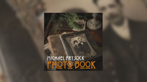
This portfolio piece highlights the commercial art direction and vintage layout architecture for Michael Prysock’s music single release, "Photo Book." The creative directive was to design a deeply nostalgic, historical and narrative driven cover art piece that complements folk, heritage rock with acoustic storytelling genres. The finalised design relies on antiquarian realism to instantly communicate themes of ancestry, time, and memory, optimised for physical CD merchandise and global digital streaming storefronts.
Design & Requirements Breakdown
Visual Symbolism - The central imagery displays a cluster of weathered, antique books resting on a dark wooden surface, topped with an ornate, leather bound vintage photo album. Framed on the album cover is a faded black and white portrait of a couple from a bygone era, surrounded by soft green foliage and a classic metal stamp in the soft focus background. This arrangement serves as a direct visual metaphor for looking into the past, preserving family legacies and uncovering forgotten stories, beautifully mirroring the single's literal title, "Photo Book."
Typographic Architecture - The design features a highly stylised, custom typography system anchored in the lower left corner of the composition to preserve the focus on the historical image. The artist’s name "MICHAEL PRYSOCK" is rendered in a sharp, geometric white font that brings a touch of modern readability to the layout. Directly beneath, the track title "PHOTO BOOK" is displayed in a bold, stylised Art Deco or vintage inspired typeface colored in an antiqued amber orange hue, establishing a clear visual hierarchy with a distinct period feel.
Premium Presentation - The promotional artwork is displayed within a high fidelity digital single mock up frame, perfectly centering the square cover art against an expanded studio vignette. The background is a heavily blurred, blown up section of the vintage portrait photography, showing an out of focus close up of a gentleman in period clothing. This presentation style adds immediate environmental depth, framing the sharp lines and intricate textures of the core asset to deliver a polished, gallery ready showcase.
Strategic Colour Choice - The colour palette is grounded in warm, earthy sepia tones, deep chocolate browns, and weathered charcoal greys, establishing a moody and authentic antique atmosphere. These dark, muted wood and leather textures are subtly broken up by the soft, organic green of the foliage and the striking amber orange of the main title typography. This specific choice of high contrast text colouring guarantees that the title text remains instantly legible and eye catching even when viewed as a small streaming thumbnail.
Target Audience Focus - The historic, story centric layout is meticulously crafted to engage fans of roots based singer songwriters, vinyl and deluxe CD collectors who appreciate high concept historical art and music consumers looking for an authentic, premium package design that honours traditional acoustic and narrative music formats.