
Palmyra Blossom Nectar Packaging Design For Sugavida
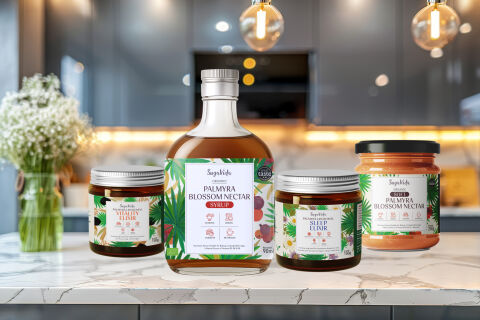
This portfolio showcase highlights the comprehensive label design and multi format packaging lineup for the SugaVida Organic Palmyra Blossom Nectar range, including their flagship syrup, elixirs, and soft nectar paste. The objective was to design a vibrant, premium, and deeply holistic packaging family that bridges natural super food wellness with gourmet culinary appeal, instantly communicating low glycemic properties, organic purity, and therapeutic health benefits.
Design & Requirements Breakdown
Visual Symbolism – The design integrates a rich, lush botanical border featuring detailed palm leaves and natural fruit illustrations, instantly anchoring the product's wild harvested plant origins. A prominent Great Taste award seal sits on the central syrup bottle, while clean vector benefit icons (highlighting attributes like organic, vegan, low GI, and rich in vitamins) ground the white center label to visually reinforce clinical health credibility and award-winning flavour.
Typographic Architecture – A delicate, elegant script logotype delivers the "SugaVida" brand identity with a premium wellness aesthetic, perfectly balanced by a bold, structured serif header for the product titles ("PALMYRA BLOSSOM NECTAR", "VITALITY ELIXIR", and "SLEEP ELIXIR") to ensure fast product identification across a diverse range of dietary formats.
Premium Presentation – The structural packaging lineup combines high clarity glass syrup bottles topped with brushed aluminum caps alongside wide-mouth amber glass and clear jars fitted with clean metal closures. The unified, wrap around label architecture ensures that mandatory nutritional information, origin stories, and dosage guidelines flow neatly around the curves while maintaining an elegant, premium presence on kitchen countertops and health food store shelves.
Strategic Colour Choice – Vibrant, organic palm greens and tropical leaf tones establish a fresh, natural baseline, heavily contrasted by a crisp white central canvas, rich golden amber syrup colours, and subtle warm red accents in the title banners to evoke natural vitality, wholesome culinary indulgence, and a trustworthy, high end super food identity.
Target Audience Focus – The clean, ingredient first layout is tailored to engage health conscious foodies and bakers looking for nutrient dense alternative sweeteners, diabetics and wellness enthusiasts requiring low sugar substitutes, and premium shoppers demanding ethically sourced, organic whole food nutrition.