
Orchestral Gold The London Symphony Orchestra Cd Cover Design
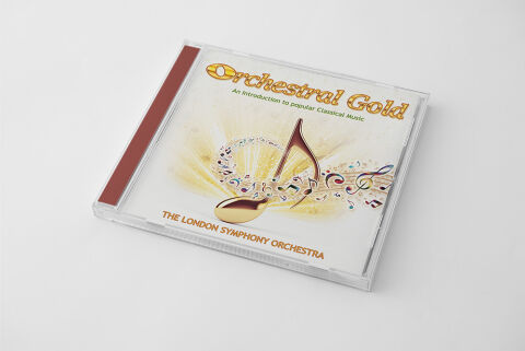
This portfolio artwork highlights the commercial print layout and graphic architecture for the "Orchestral Gold: An Introduction to Popular Classical Music" compilation CD cover design, featuring The London Symphony Orchestra. The objective was to design a highly elegant, inviting, and visually harmonious album cover that makes classical music accessible and engaging. The layout instantly communicates an upscale yet approachable auditory experience, establishing a striking product identity optimised for physical retail distribution and digital music storefronts.
Design & Requirements Breakdown
Visual Symbolism - The design features an elegant central graphic consisting of a stylised, gleaming gold eighth note floating above a swirling, multi-coloured staff of musical notation, serving as the core visual narrative. Radiant, warm light bursts out from behind the central note, filling the canvas with an ethereal glow. This evocative focal imagery seamlessly reinforces themes of symphonic movement, creative inspiration and the soaring, uplifting emotional power of premier orchestral arrangements.
Typographic Architecture - The layout incorporates a refined, high contrast typography system designed to balance institutional prestige with commercial appeal. The main title "Orchestral Gold" is arched across the upper third quadrant, rendered in a bold, metallic gold display font with a crisp white and dark outline that ensures strong dimension. Directly below it, the explanatory subtitle "An introduction to popular Classical Music" is set in a delicate, high legibility serif typeface. At the base of the layout, the performer branding "THE LONDON SYMPHONY ORCHESTRA" is presented in a clean, authoritative sans-serif font, creating an effortless information hierarchy tailored for immediate recognition.
Premium Presentation - The promotional artwork is presented in a high fidelity physical product mock up, showcasing the front cover booklet neatly encased within a premium, clear crystal jewel case. The left edge features a solid, deep crimson spine inlay that injects a structured, classical framing element to the presentation. This focused layout highlights the sharp print resolution, the pristine white of the negative space and the smooth radial gradients of the background glow, offering a highly tactile preview of a completed commercial release ready for manufacturing.
Strategic Colour Choice - A sophisticated, light filled palette of bright ivory whites and shimmering golden yellow sunbursts forms the primary canvas, projecting a clean, upscale, and airy aesthetic. This luminous foundation is grounded by bold pops of deep amber in the main lettering, deep crimson along the physical spine, and playful hints of blues and reds within the floating musical notes. This distinct colour configuration injects an immediate sense of prestige, balancing traditional classical elegance with a bright, contemporary visual tone that easily stands out on competitive store shelves.
Target Audience Focus - The structured, concept first layout is meticulously tailored to engage casual listeners looking for an accessible entry point into classical masterpieces, dedicated symphony enthusiasts seeking polished physical compilations and retail music consumers demanding a transparent, highly professional package design that beautifully honors a timeless orchestral collection.