
Old Jacob's Retro Confectionery Packaging Design
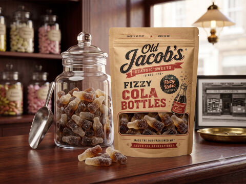
This portfolio piece highlights the nostalgic, heritage focused art direction and classic layout architecture designed for Old Jacob's premium retro confectionery line. The design objective was to build an authentic, heartwarming structural pouch design that perfectly captures the charm, craft and magic of a traditional mid-century sweet shop. The packaging strategy utilises historical branding cues, playful vintage badges and an integrated product window to instantly establish hand crafted quality and nostalgic indulgence, optimised for an eye catching commercial presence across both specialty confectionery retail shelves and online storefronts.
Design & Requirements Breakdown
Visual Symbolism – The packaging features a prominent, die cut window at the lower centre, revealing the authentic textures of the sugar dusted fizzy cola bottles inside. This is framed by a hand drawn retro glass cola bottle illustration and a classic banner graphic stating "Sweets as they used to be!" This timeless visual structure immediately evokes childhood nostalgia, old-fashioned candy making heritage and comforting sweet shop memories, beautifully complemented by a rustic wooden counter presentation complete with traditional glass apothecary jars, a metal candy scoop and a historic black and white shop photograph.
Typographic Architecture – A bold, custom vintage script typeface gives the master brand name "Old Jacob's" immediate, nostalgic identity recognition, accented by clean red ribbon banners reading "Classic Sweets" and "Since 1898." Directly underneath, the product title "FIZZY COLA BOTTLES" is rendered in a distressed, heavy wood block style slab serif font, which perfectly pairs with circular starburst badges highlighting product features ("Full of Fizzy Retro Flavour!") and a bottom-anchored slogan ("Loved for Generations!") to guarantee maximum on shelf readability and traditional charm.
Premium Presentation – The design leverages a modern, self-standing resealable pouch structure while utilising a textured, tactile kraft paper substrate appearance. This blend of contemporary functionality and rustic, historical texture allows multi-tier nutritional data, barcode placement and ingredient storytelling to wrap cleanly onto the back of the pouch without interrupting the primary, high impact front of pack presentation.
Strategic Colour Choice – The colour palette relies on a comforting, warm toned scheme of natural kraft browns, rich chocolate and deep charcoal, accented by vibrant pops of traditional candy stripe red and cream. This deliberate choice bypasses the cold, synthetic neon styling of modern candy wrappers to ground the brand entirely within an authentic, premium artisan aesthetic that emphasises natural ingredients and historical recipes.
Target Audience Focus – The narrative first, historic packaging layout is meticulously crafted to engage nostalgic adults seeking a taste of their childhood, parents looking to share traditional sweets with younger generations and premium gift buyers demanding highly polished, authentic confectionery packaging that honours traditional British sweet making heritages.