
NexGen Health Supplements Range Label Design
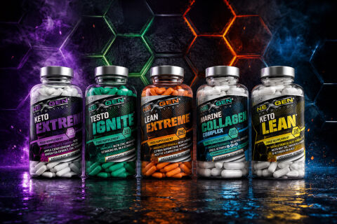
This portfolio piece highlights the high octane art direction and structured, science focused brand architecture designed for NexGen Nutrition’s comprehensive health supplements line. The design objective was to build a cohesive, premium family of labels that communicates advanced scientific formulation, metabolic performance and physical vitality across five distinct product offerings: Keto Extreme, Testo Ignite, Lean Extreme, Marine Collagen Complex and Keto Lean. The visual strategy relies on a unified, high contrast structural grid that scales across different colours, ensuring instant brand recognition while adapting to unique specialised fitness and wellness categories.
Design & Requirements Breakdown
Visual Symbolism – Each label features an aggressive, high impact technical carbon weave pattern texture that grounds the central product banners, framed by a sleek metallic brand logo and a crisp, brushed silver cap finish. This hyper modern visual structure immediately evokes scientific precision, lab grade purity and advanced physiological optimisation, beautifully mirror matched by a dramatic, glowing sci-fi hexagonal background grid.
Typographic Architecture – A heavy, italic sans serif display typeface gives each product name immediate, high velocity brand recognition, which is perfectly balanced by structured, high contrast key line text blocks detailing capsule capacity counts (such as 180 and 240 capsules) and active formulation highlights including apple cider vinegar, zinc, vitamins B6 & B12, green tea extract and citrus aurantium for maximum on shelf and digital thumbnail readability.
Premium Presentation – The wraparound label design maximises printable real estate on transparent, capsule filled bottles, allowing multi-tier regulatory copy, nutritional panels, dosage instructions and active ingredient tables to wrap smoothly around the container without cluttering the primary front of pack shelf presentation.
Strategic Colour Choice – A unified charcoal base is colour coded across the spectrum using hyper saturated shades of electric purple, jade green, fiery orange, cyan blue and neon yellow to differentiate the respective formulas (Keto, Testo, Lean, Collagen) while maintaining a strict, premium sports nutrition brand identity.
Target Audience Focus – The clean, benefit first label layout is tailored to attract performance driven athletes seeking specialised training support, fitness enthusiasts prioritising high potency active formulations and premium retail consumers demanding an authentic, authoritative design that honours modern bio-hacking and advanced nutritional science.