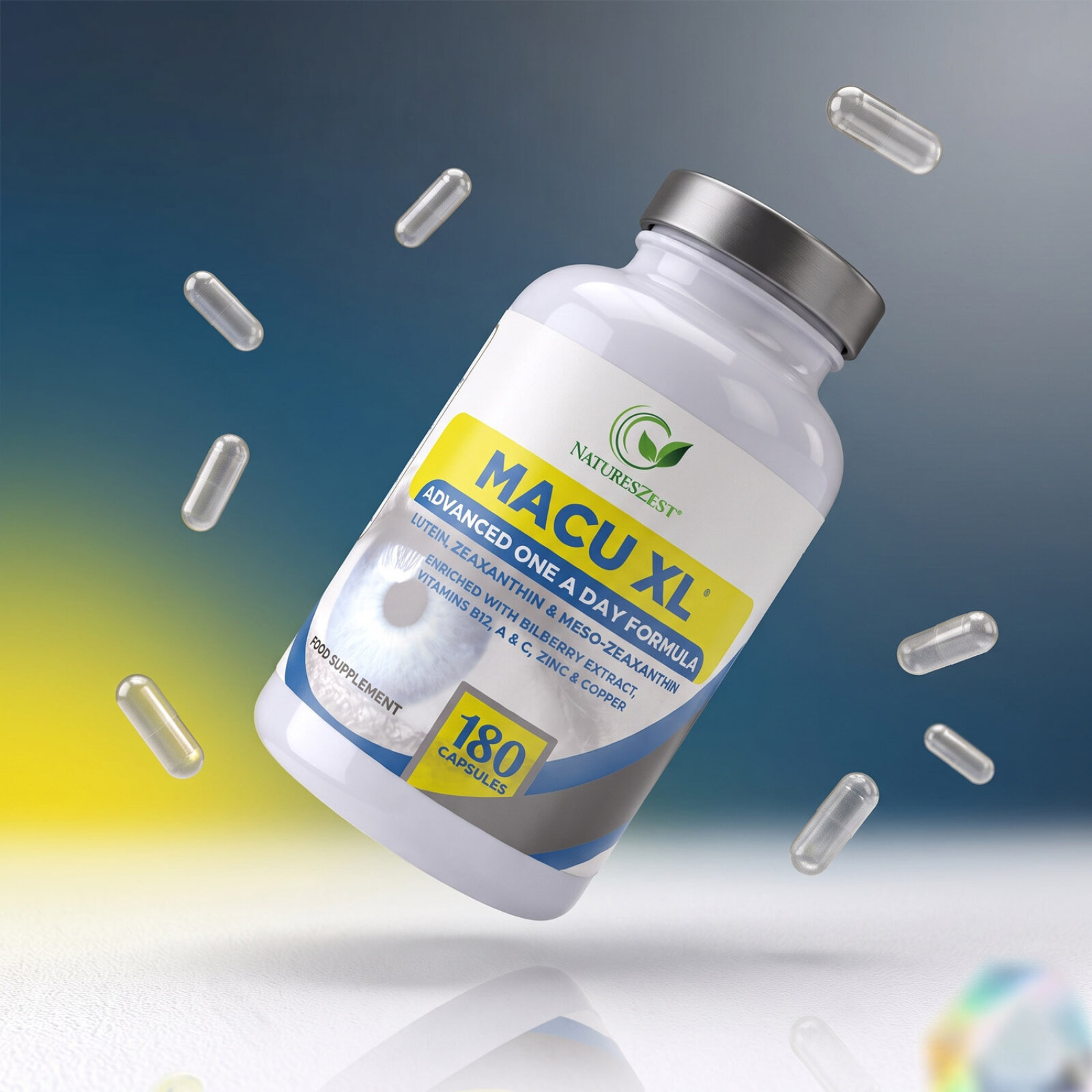
Natures Zest Supplements Range Label Design

This portfolio piece highlights the clean, nature infused art direction and structured, wellness focused brand design for Natures Zest’s comprehensive health supplements line. The design objective was to build a cohesive, premium family of labels that communicates natural botanical purity, dietary wellness, and daily health support across multiple product lines: Saccharomyces Boulardii, Sleep Soothe, Fibrepro, Acidophilus, Bio Cultures, and 5-HTP. The visual strategy relies on a unified, approachable structural grid that seamlessly scales across different colours, ensuring instant brand recognition while adapting to unique specialised wellness, gut health, and sleep support categories.
Design & Requirements Breakdown
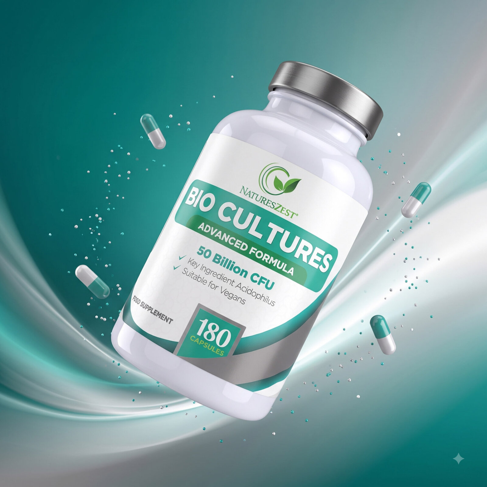
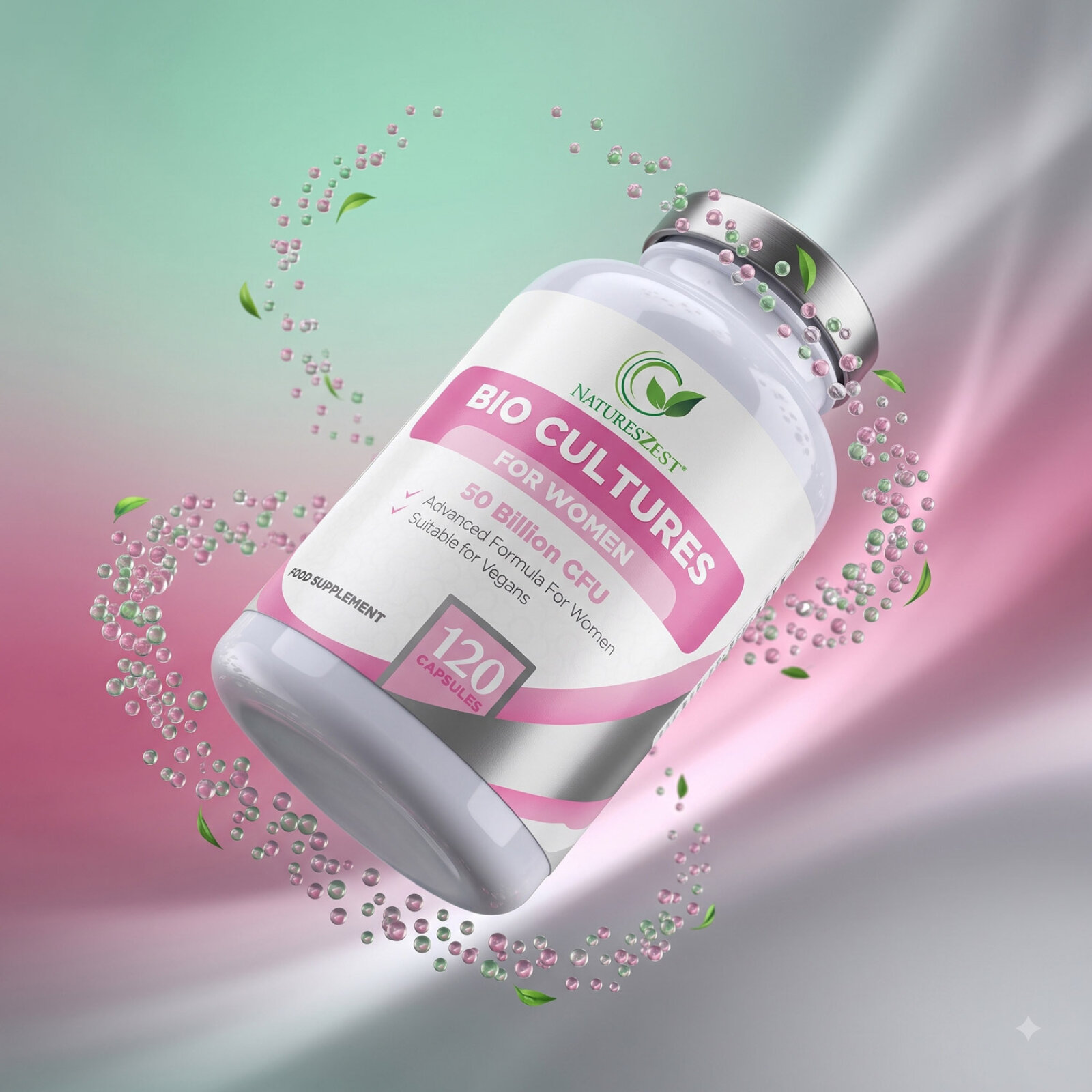
Visual Symbolism – Each label features a dynamic, swooping wave or circular curve pattern that grounds a high impact central product banner, framed by a leaf emblem logo and a crisp silver metallic cap finish. This fluid visual structure immediately evokes natural botanical purity, active digestive wellness, and modern nutraceutical formulation, beautifully complemented by an organic, sunlit botanical background presentation filled with fresh green foliage, lavender blooms and slate accents.
Typographic Architecture – A heavy, bold sans serif display typeface gives core product names like "FIBREPRO", "BIO CULTURES" and "SLEEP SOOTHE" immediate brand recognition, which is perfectly balanced by structured white and colour blocked key line elements detailing high strength dosage call outs (such as 50 Billion CFU, 400mg), capsule quantities (60, 120, 180, 240) and key active ingredients including psyllium husk, inulin, aloe vera, chamomile, 5-HTP, and lavender for maximum on shelf and digital thumbnail readability.
Premium Presentation – The wraparound label design maximises printable real estate on glossy white containers, allowing multi-tier regulatory copy, dosage guidelines, allergen warnings and ingredient lists to wrap smoothly around the bottle without cluttering the primary front of pack shelf presentation.
Strategic Colour Choice – A crisp, clinical white background base is colour coded across the product spectrum using vibrant shades of lime green, deep indigo night blue, rich violet purple, emerald green and bright cyan blue to differentiate the respective formulas (Gut Health, Sleep, Fibre, and Mood Support) while maintaining a unified, fresh, premium health store visual identity.
Target Audience Focus – The clean, benefit first label layout is tailored to attract health conscious adults seeking daily gut support, wellness enthusiasts prioritising clean botanical ingredients and online shoppers looking for high capacity, long supply daily supplements that honour traditional herbal wisdom and advanced nutritional science.