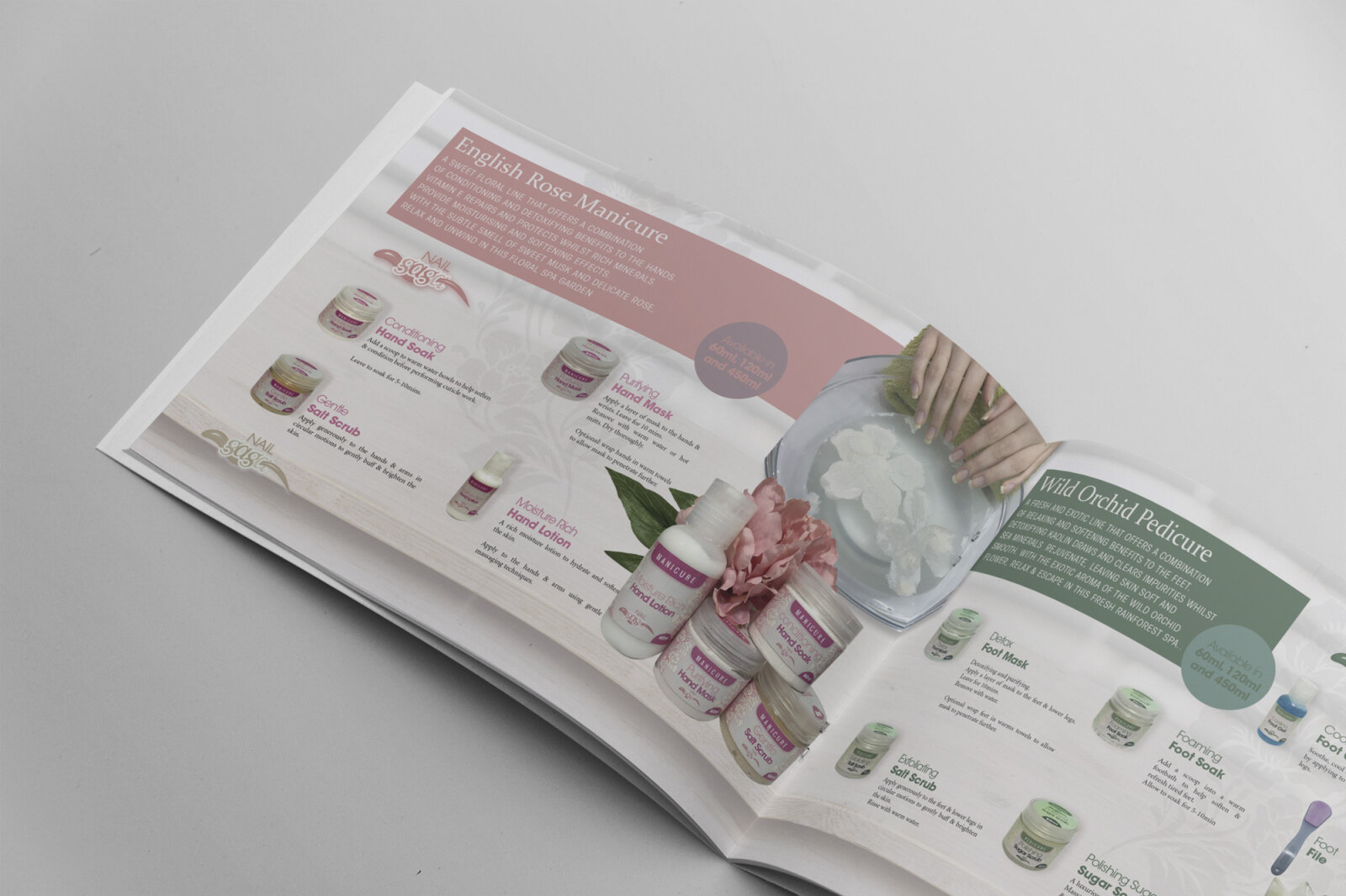
Nail Gaga 2016 Product Brochure Design
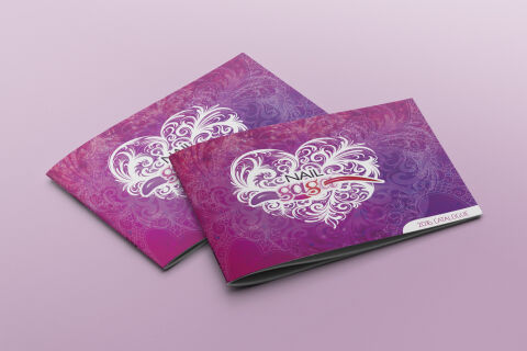
This portfolio design highlights the glamorous, salon focused art direction and intricate layout architecture designed for Nail Gaga’s professional product catalogue. The design objective was to build a striking, fashion-forward landscape brochure that captures the vibrant, creative spirit of the nail artistry and beauty industry. The visual strategy relies on a heavily textured, artistic background coupled with a high impact central emblem to instantly establish brand authority, creative trendsetting and premium product quality across professional salons, trade shows, and business distributor showcases.
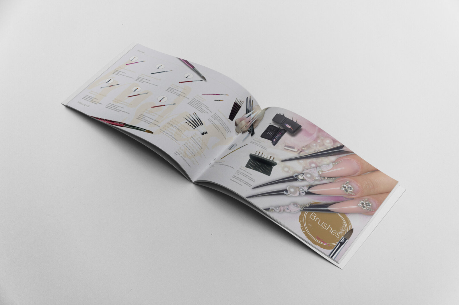
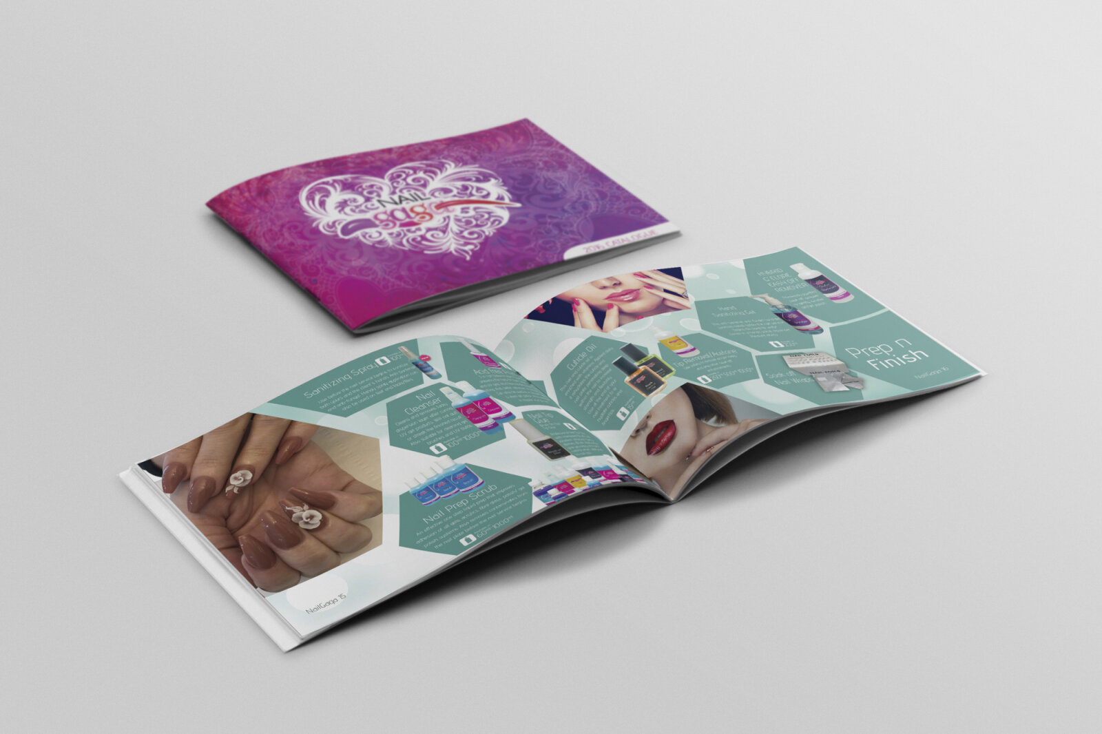
Design & Requirements Breakdown
Visual Symbolism – The cover layout features an intricate, central heart shaped filigree emblem constructed from elegant, swirling lace like flourishes. This delicate, ornamental centre piece beautifully mirrors the precise, detailed craftsmanship required in high end nail art, while the complex background tapestry of overlapping lace textures and damask patterns symbolises layered artistry, luxury salon pampering and feminine sophistication, showcased against a soft, complementary lavender studio backdrop.
Typographic Architecture – A stylised, custom logotype anchors the centre of the heart design, combining clean sans serif typography for "NAIL" with a flowing, playful script for "gaga," accented by a fluid red brushstroke that mimics a glossy swipe of professional nail polish. On the lower right margin, the collection identifier "2016 CATALOGUE" is housed cleanly within an elegant white rounded tab block, ensuring that key chronological ordering data remains perfectly legible without interrupting the rich background textures.
Premium Presentation – The multi-page brochure is displayed in a premium, landscape oriented stacked print mock up format that highlights the horizontal booklet geometry. The presentation emphasises a clean, three dimensional flat lay perspective that draws immediate focus to the crisp edge alignments and rich print saturation, proving that promotional salon catalogs can feel like a high end, collectable fashion lookbook.
Strategic Colour Choice – The colour palette relies on an ultra vibrant, deeply saturated gradient scheme blending intense magentas, rich plums and deep violet purples. This luxurious, regal colour combination completely avoids dull or clinical aesthetics to inject an energetic, artistic salon identity into the brand, while the stark white filigree lines and logo accents cut sharply through the dark textures to provide essential visual contrast.
Target Audience Focus – The design first, sensory layout is meticulously tailored to engage professional nail technicians, salon owners, and beauty school academies looking for premium product lines. It targets discerning trade buyers demanding a professional, trend forward catalogue that honours cosmetic artistry and premium styling supplies while maintaining a highly scannable, intuitive layout for wholesale product browsing.