
Music Single Cover Art For Cherry Hill Were All Going To Die
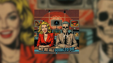
This portfolio design layout highlights the graphic architecture for the Cherry Hill We're All Going To Die Album Cover Design. The objective was to design a highly atmospheric, conceptually bold, and satirical album cover that bridges vintage mid-century comic book art with dark, apocalyptic social commentary, instantly communicating an edgy alternative rock or conceptual music project identity ready for physical and digital distribution.
Design & Requirements Breakdown
Visual Symbolism – The design features a striking pop art illustration of a smiling, glamorous 1950s news anchor sitting directly alongside a skeleton co-host in a business suit, serving as the core visual narrative. Positioned behind this broadcast desk duo is a wall of retro television monitors displaying global catastrophes and nuclear explosions beneath a glowing red atomic sun grid. This powerful juxtaposition of upbeat media commercialism against grim, apocalyptic imagery beautifully reinforces themes of dark humour, societal desensitisation, and political satire.
Typographic Architecture – The layout blocks out the provocative album title across the lower third of the composition using a highly stylised, distressed comic book display font. The phrase "WE'RE ALL" is rendered in a clean, bold white with a heavy drop shadow, while the connecting phrase "GOING TO DIE" is highlighted in a vibrant, glowing cyan hue. This deliberate typographic alignment introduces an immediate visual contrast, ensuring maximum legibility on digital streaming thumbnails and streaming platforms while maintaining a distinct pulp novel branding signature.
Premium Presentation – The promotional artwork is presented in a high fidelity digital and print preview composition, framed beautifully against a warm, heavily blurred studio backdrop mirroring the main characters. This focused vignette layout emphasises the sharp print resolution, the complex line work of the central square cover art and the intricate grid alignment of the background control room, offering a highly tactile and professional preview of a completed commercial release ready for vinyl sleeve production or digital distribution.
Strategic Colour Choice – A sophisticated, moody palette of fiery crimson red, deep charcoal, and aged cream tones forms the primary brand signature canvas, evoking an intense sense of cinematic alarm and retro authenticity. This warm foundation is starkly interrupted by the piercing cyan teal used in the typography and the central television screen icon. This strategic colour choice injects immediate visual tension, ensuring the package cuts through competing alternative and indie album displays in physical and digital retail environments.
Target Audience Focus – The structured, concept first layout is meticulously tailored to engage alternative, punk, or indie music listeners who value deep visual irony and immersive concept storytelling. It captures the attention of modern audiophiles and retail music shoppers demanding a transparent, highly professional package design that beautifully honours the album's raw, existential and counter culture themes.