
Munchkins Hair Bows Logo Design
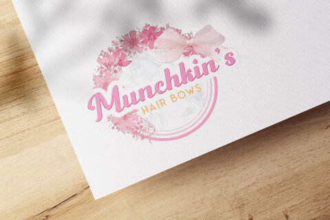
This portfolio showcase highlights the brand identity development for Munchkin's Hair Bows. The objective was to design a whimsical, charming, and highly boutique emblem that perfectly captures the playful, handcrafted nature of premium children's hair accessories.
Design & Requirements Breakdown
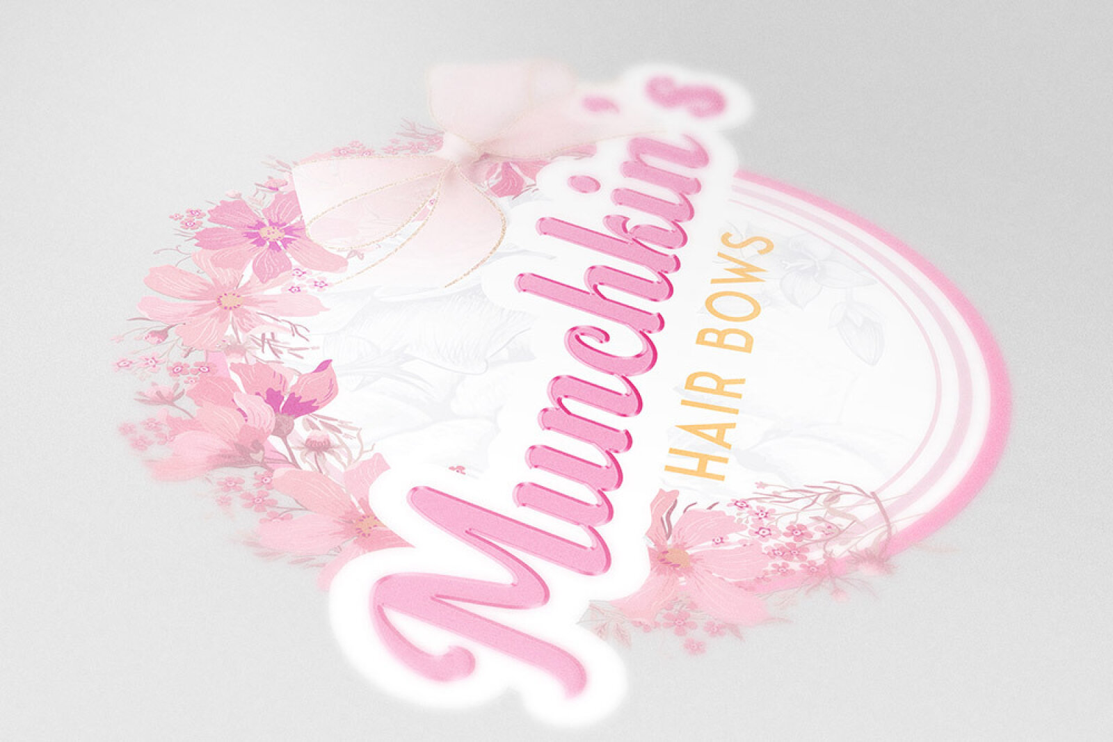
Visual Symbolism - The icon integrates a beautifully illustrated, delicate floral wreath wrapped around a circular frame, crowned by a prominent, realistic fabric bow to immediately communicate the core product offering.
Typographic Architecture - A friendly, flowing script font with soft curves is used for "Munchkin's" to evoke childhood playfulness, balanced by a clean, geometric sans-serif typeface for the underlying text.
Premium Presentation - The multi layered vector artwork features intricate petal details and soft fabric shading, rendering flawlessly as a high end sticker or print on retail product backing cards.
Strategic Colour Choice - A vibrant palette of blossom pinks and candy tones is paired with a warm, sunshine yellow accent to evoke pure joy, gentle warmth, and a sweet, youthful aesthetic.
Target Audience Focus - The delicate, artisanal composition is tailored to attract parents, gift shoppers, and boutique retailers looking for high quality, lovingly handcrafted hair accessories for babies and children.