Midland Beauty Expo 2023 Flyer Design
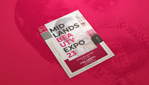
This portfolio showcase highlights the event branding architecture and commercial print layout for the Midlands Beauty Expo 2023 promotional flyer design. The objective was to design a highly professional, striking, and high energy marketing asset that bridges trade exhibition authority with contemporary editorial fashion aesthetics, instantly communicating industry prestige, cosmetic trend leadership and clear event accessibility coordinates.
Design & Requirements Breakdown
Visual Symbolism – The design features a stylised, high contrast photographic portrait of a model integrated seamlessly behind the primary typographic blocks on the white canvas. This artistic beauty theme is brilliantly mirrored on a grand scale across the backdrop, where a massive, stylised portrait watermark with text textured overlay dominates the rich magenta studio canvas, visually reinforcing industry immersion, creative artistry and absolute brand transparency.
Typographic Architecture – A bold, blocky sans-serif display typeface anchors the main layout, breaking out the event title "MIDLANDS BEAUTY EXPO 23" across stacked, left aligned rows. The word "BEAUTY" and the year indicator are highlighted in a vibrant magenta to break visual monotony. In the lower margins, clean, highly legible white sans-serif text blocks out the official date, specific hours, and the host location details such as the "CBS ARENA COVENTRY", while a dedicated black calendar tab anchors the specific event coordinates to keep a lightweight information hierarchy optimised for effortless reading.
Premium Presentation – The promotional collateral is presented in a premium 3D print mock up perspective showcasing a single printed flyer sheet resting at an angled, floating orientation on an immersive, deep magenta studio background. This composition emphasises mass print production sharpness, precise page border definitions, and realistic surface casting, offering a highly tactile preview of a premium B2B event marketing touch point.
Strategic Colour Choice – A sophisticated, ultra vibrant palette of deep magenta, stark charcoal black, and crisp white forms the core brand signature elements and graphic borders. This distinct, high impact palette evokes immediate cosmetic fashion trust, energetic retail logic and an easily recognisable exhibition brand identity that commands attention on a promotional counter display or in a digital press kit.
Target Audience Focus – The structured, event first layout is tailored to engage professional makeup artists looking for networking opportunities, independent beauty salon owners seeking to source upcoming product trends and commercial cosmetics distributors demanding transparent, highly professional trade show communication.