

Michael Prystock Five Dime Album Cover Design
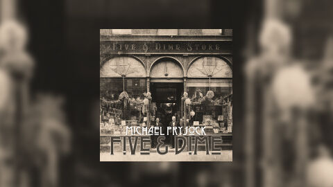
This portfolio showcase highlights the commercial print layout and graphic architecture for the Michael Prystock Five & Dime Album CD Cover Design. The objective was to design a deeply nostalgic, historical, and narrative driven album cover that bridges acoustic folk, roots rock and Americana musical heritage with premium physical and digital packaging, instantly communicating vintage storytelling, architectural charm and a striking product identity for retail distribution.
Design & Requirements Breakdown
Visual Symbolism – The design features a authentic, high contrast archival photograph of a classic, turn of the century "Five & Dime Store" storefront as the primary visual anchor. This rustic and historic theme is beautifully layered into the graphic architecture via intricate window displays, arched entryways and two storekeepers standing proudly at the entrance. This visual layout seamlessly reinforces themes of community heritage, timeless craftsmanship, acoustic authenticity and a deeply grounded singer songwriter narrative.
Typographic Architecture – A stylised, vintage inspired Art Deco display typeface anchors the main layout along the lower third quadrant. The artist's name "MICHAEL PRYSTOCK" is rendered in a crisp, clean white sans-serif style, while the album title "FIVE & DIME" is boldly stylised with architectural line motifs that mirror the vintage storefront design. This deliberate typographic alignment keeps a lightweight information hierarchy optimised for effortless reading across streaming platforms or physical media displays while establishing a distinct, heritage branding signature.
Premium Presentation – The promotional artwork is presented in a high fidelity digital and print preview composition, framed beautifully against a warm, heavily blurred sepia vignette derived from the storefront photography. This focused layout emphasises the sharp print resolution, intricate historical details, and dramatic sepia-toned contrasts of the central square cover art, offering a highly tactile and professional preview of a completed commercial music release ready for digital audio distribution or physical package manufacturing.
Strategic Colour Choice – A sophisticated, antique palette of deep sepia browns, muted charcoal greys, and warm cream tones forms the core brand signature canvas. This monochromatic approach evokes immediate historical intrigue, roots music authenticity, and a timeless visual identity that cuts through competing digital storefronts by honoring the classic aesthetic of early photography.
Target Audience Focus – The structured, heritage first layout is tailored to engage dedicated Americana, folk, and indie music collectors looking for authentic physical or digital releases, history enthusiasts seeking immersive visual storytelling, and retail music shoppers demanding a transparent, highly professional package design that beautifully honors the album's nostalgic theme.