
Memory Stationary Design
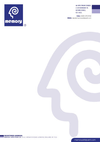
This portfolio showcase highlights the corporate document architecture and print asset layout for the Memory Letterhead Stationery Design. The objective was to design a highly professional, clean, and modern corporate letterhead that bridges psychological resonance with fluid creative design, instantly communicating conceptual precision, corporate reliability, and structured business communication.
Design & Requirements Breakdown
Visual Symbolism – The design features a stylised, minimalist silhouette of a human head containing an integrated spiral brain motif, nested within a solid blue square that crowns the upper left corner as the primary brand mark. This unique geometric structure is echoed beautifully across the background canvas via a large, oversized, low opacity lavender watermark that anchors the lower right quadrant, visually reinforcing deep cognitive thought, creative memory processes, and corporate transparency.
Typographic Architecture – A playful yet clean custom lowercase typeface blocks out "memory" directly beneath the main head emblem inside the logo badge. In the upper right hand margin, a lightweight sans-serif typeface maintains a highly precise, right aligned block, balancing essential corporate contact coordinates, physical address details, and digital communication links to keep a lightweight information hierarchy optimised for effortless reading.
Premium Presentation – The corporate stationery is presented in a flat, high resolution layout resting on a crisp white writing canvas. This clean composition showcases a single, official printed letterhead sheet flanked by structured corporate footer accents, including an official registered address line at the bottom left and a dedicated, rounded rectangular blue bar anchoring the digital web link at the bottom right.
Strategic Colour Choice – A sophisticated, professional palette of deep royal blue and soft lavender forms the core brand signature and colour blocks, heavily contrasted by a crisp white paper writing canvas and the muted lavender background watermark. This distinct, contrasting palette evokes immediate corporate trust, cognitive wellness, and a clean, recognisable creative brand identity.
Target Audience Focus – The structured, corporate first layout is tailored to engage professional creative partners seeking innovative design collaboration, corporate distributors demanding transparent and professional business communication, and institutional clients looking for highly reliable, structured organisational solutions.