
LP System Automation Brochure Design
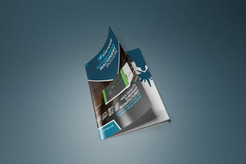
This portfolio piece highlights the technical art direction and structural layout architecture designed for the LP Systems corporate automation brochure. The design objective was to build a robust, precision focused print and digital document that caters to the industrial engineering, automation machinery and manufacturing sectors. The visual strategy relies on clean geometric divisions and corporate structural modules to instantly establish technical expertise, manufacturing trust and operational efficiency across high stakes corporate meetings and business distributor consultations.
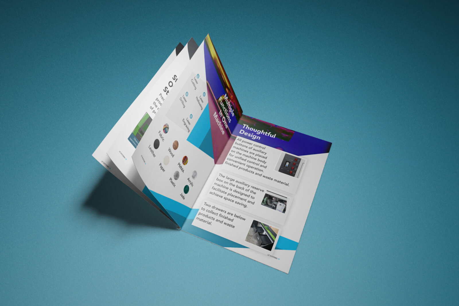
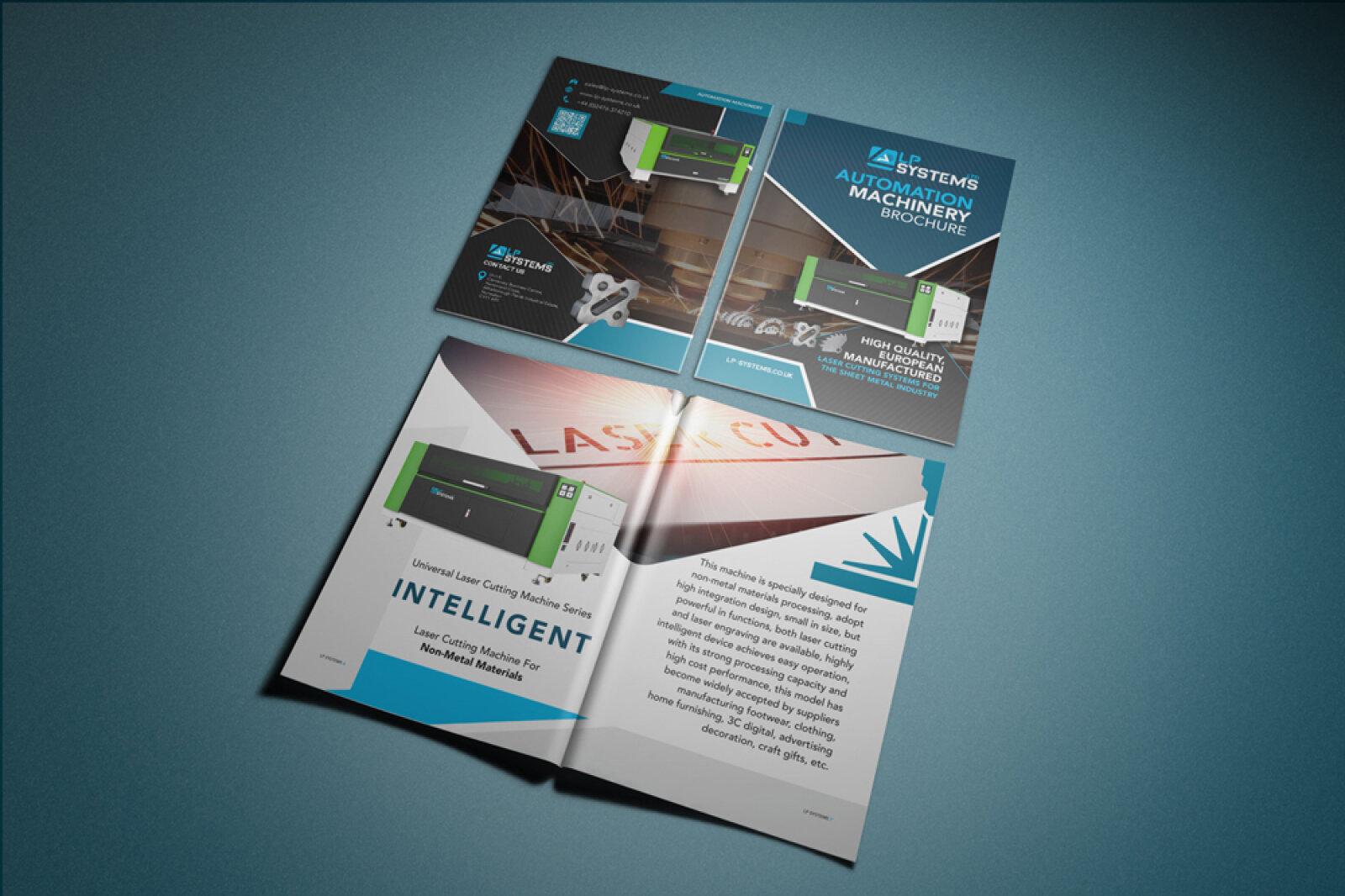
Design & Requirements Breakdown
Visual Symbolism – The cover layout features a dynamic, curving architectural colour block framework that elegantly segments the page into highly structured operational zones. This fluid yet rigid layout style mirrors the precise motion of automated machinery, framing crisp photography of heavy machinery components and industrial laser cutting setups to symbolise engineering innovation, fluid workflow automation and mechanical mastery.
Typographic Architecture – A bold, clean sans serif typeface organises the primary cover headlines ("AUTOMATION MACHINERY BROCHURE") with absolute corporate authority, neatly aligned with the master logo branding for "LP SYSTEMS" at the top header. Crucial selling points ("HIGH QUALITY EUROPEAN MANUFACTURED") are rendered in structured, high contrast white text blocks, while specific niche application headings use a bright cyan blue to guarantee immediate editorial readability and trust.
Premium Presentation – The brochure design is showcased in a high fidelity, dynamic digital print mock up that simulates a real world page curl. This presentation format elegantly reveals a hint of the interior page layout underneath, emphasising a premium paper stock appearance and crisp trim alignments. The entire booklet composition is set against an expansive, textured slate blue vignette backdrop that mimics a high end corporate studio environment.
Strategic Colour Choice – A powerful, professional palette of deep industrial blues, rich charcoals, and clean whites forms the foundational grid, injected with energetic pops of a vibrant cyan accent colour. This deliberate combination steps away from dated, heavy industrial aesthetics to project a forward thinking, high tech engineering identity that feels clean, modern and trustworthy to industrial procurement officers.
Target Audience Focus – The structured, corporate first layout is meticulously tailored to engage procurement managers, operations officers, and industrial engineers looking for a highly reliable automation machinery partner. It targets discerning corporate buyers demanding a professional, authoritative document that simplifies complex engineering parameters while clearly communicating safety, reliability and manufacturing excellence.