
Lonsdale Coconut Water Packaging Design
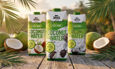
This portfolio showcase highlights the packaging design and carton execution for Lonsdale London Natural Coconut Water. The objective was to design a fresh, high impact aseptic carton range that bridges athletic endurance hydration with tropical natural purity, instantly communicating 100% natural coconut water, fast electrolyte replenishment, and active lifestyle recovery.
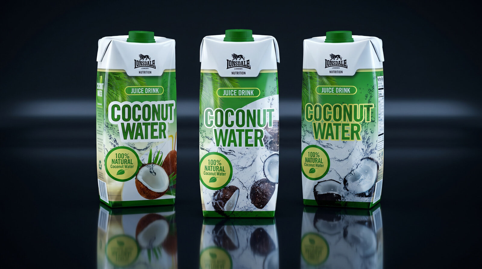
Design & Requirements Breakdown
Visual Symbolism – The design features dynamic water splashes surrounding cracked open whole coconuts, framed by a tropical palm frond canopy and Lonsdale's iconic lion crest emblem. A prominent round "100% NATURAL Coconut Water" seal reinforces organic purity, tropical freshness, and natural isotonic hydration.
Typographic Architecture – A heavy, bold block display font commands primary attention with "COCONUT WATER," crowned by a clean green header banner reading "JUICE DRINK" and Lonsdale’s signature athletic logotype for immediate, uncluttered brand recognition on busy beverage shelves.
Premium Presentation – The multi size Tetra Pak carton presentation incorporates ergonomic green screw caps and full bleed graphics across all faces. The structural layout seamlessly scales across individual single serve sizes and large 1 litre family cartons while maintaining a cohesive, refreshing visual identity.
Strategic Colour Choice – Vibrant palm green and bright emerald tones form a lush, health focused core, contrasted by stark white liquid splashes, natural coconut shell browns, and warm lime accents to signal pure botanical hydration and active daily wellness.
Target Audience Focus – The energetic, nature first layout is tailored to engage sports enthusiasts, gym goers seeking natural post workout electrolyte recovery, and health conscious consumers looking for clean, additive free tropical hydration options.