
Lm Estates Stationary Design
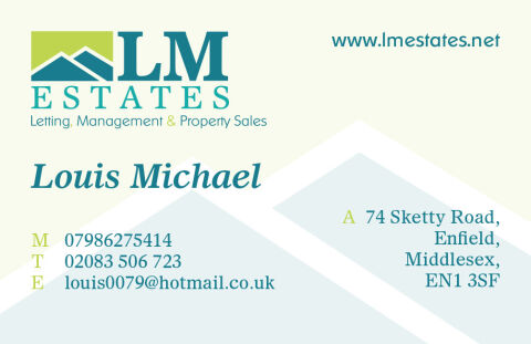
This portfolio showcase highlights the corporate identity design and print asset layout for the LM Estates Business Card. The objective was to design a highly professional, clean, and welcoming corporate business card that bridges property management authority with elegant graphic design, instantly communicating real estate precision, corporate reliability, and structured property communication.
Design & Requirements Breakdown
Visual Symbolism – The design features a stylised, abstract interlocking roof and hillside icon composed of clean blue and lime green angles that crowns the upper left corner as the primary brand mark. This architectural structure is echoed beautifully across the background canvas via large, low opacity ice blue geometric roof watermarks that peak across the lower right margins, visually reinforcing domestic shelter, property portfolios, and corporate transparency.
Typographic Architecture – A bold, classic serif display typeface blocks out "LM ESTATES" directly beside the main emblem, accompanied by a smaller, refined sans-serif sub tagline reading "Letting, Management & Property Sales" utilising an alternating blue and lime green colour hierarchy. Across the canvas, a sophisticated italic serif typeface elegantly presents the name "Louis Michael", while precise left and right alignments split the essential contact coordinates and physical address details to keep a lightweight information hierarchy optimised for effortless reading.
Premium Presentation – The professional stationery is presented in a flat, crisp layout resting on a soft, off white cream studio backdrop. This clean graphic composition showcases a single, official printed card front embedded with single letter indicators ("M", "T", "E", "A") highlighted in a vibrant lime green font to create a neat, highly organised executive layout.
Strategic Colour Choice – A sophisticated, professional palette of deep teal blue and bright lime green forms the core brand signature and logo components, heavily contrasted by a soft cream paper writing canvas and the pale blue background roof watermarks. This distinct, organic palette evokes immediate corporate trust, environmental logic, and a clean, recognisable premium property brand identity.