
Lm Estates Rental Flyer Design
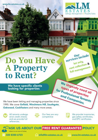
This portfolio showcase highlights the commercial print architecture and direct mail marketing layout for the LM Estates Rental flyer design. The objective was to design a highly professional, striking, and persuasive property procurement flyer that bridges real estate authority with clear, action oriented graphic design, instantly communicating letting precision, landlord security and structured business communication.
Design & Requirements Breakdown
Visual Symbolism – The design features a realistic, vibrant photography banner showcasing a row of classic British residential townhouses across the upper half of the canvas. This real estate theme is beautifully anchored into the graphic architecture via a prominent, bright green house silhouette graphic on the right margin acting as a primary call out badge. Swirling, multi layered lime green curves cut dynamically through the centre margins, visually reinforcing localised property coverage, structural expansion, and corporate transparency.
Typographic Architecture – A bold, heavy sans-serif display typeface blocks out the primary headline inquiry "Do You Have A Property to Rent?" across the left center quadrant, utilising a high contrast lime green and deep teal color hierarchy to maximise immediate readability. To highlight urgent demand, a slanted, rounded rectangular call out box outlines tenant requirements in a vivid crimson red boundary. Along the lower margin, clean sans-serif typography maintains a highly precise alignment to prioritise regional coverage areas such as Enfield, Winchmore Hill, and Southgate, alongside a prominent yellow footer driving conversion via an official "FREE RENT GUARANTEE POLICY" announcement.
Premium Presentation – The promotional collateral is presented in a flat, high definition layout utilising structured, organic content curves to blend multiple photographic, vector and informational elements into a cohesive graphic canvas. This clean composition showcases a dedicated row of minimalist corporate icons detailing tenant vetting, competitive fees, and compliance certificates to keep a lightweight information hierarchy optimised for effortless reading by landlords.
Strategic Colour Choice – A sophisticated, property first palette of deep teal, vibrant lime green, and bright yellow forms the core brand signature elements and graphic banners, heavily contrasted by a crisp white paper canvas and realistic brick and foliage photographic tones. This distinct, high contrast palette evokes immediate consumer trust, estate management logic, and a highly recognisable local property brand identity that stands out in a crowded mailbox.
Target Audience Focus – The structured, solution first layout is tailored to engage independent residential property landlords looking for reliable lettings management, property investors seeking elite rent collection security, and local homeowners demanding transparent, highly professional emergency or routine property consultation.