
Live To Rock By Stone Alibi Music Single Cover Design
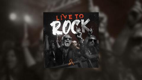
This portfolio artwork highlights the commercial print layout and graphic architecture for the Stone Alibi Live To Rock Music Single CD Cover Design. The objective was to design a highly atmospheric, energetic and gritty CD single cover that bridges classic rock, hard rock, and heavy metal musical heritage with premium physical and digital packaging, instantly communicating raw stadium energy, a rebellious edge and a striking product identity for retail distribution.
Design & Requirements Breakdown
Visual Symbolism – The design features a realistic, high contrast monochrome photograph of an ecstatic, elder rock fan wearing sunglasses at the barrier of a concert crowd, raising their hands in celebration as the primary visual anchor. This raw and nostalgic rock theme is beautifully layered into the graphic architecture via heavy film grain, subtle stage light flares, and a textured overlay of dust and scratches. This visual layout seamlessly reinforces themes of lifelong passion, community, visceral live music energy and a deeply authentic rock and roll narrative.
Typographic Architecture – A bold, distressed brush stroke display typeface anchors the main layout, breaking out the primary title "ROCK" in a high visibility textured white across the upper half of the cover. Directly above, the prefix "LIVE TO" is rendered in a sharp, fiery orange red textured font, creating a dynamic colour contrast. At the bottom center, a sleek, custom minimalist vector emblem represents the band's signature "Stone Alibi" logo in orange red, maintaining a balanced information hierarchy optimised for effortless reading across streaming platforms or physical media displays.
Premium Presentation – The promotional artwork is presented in a high fidelity digital and print preview composition, framed beautifully against a warm, heavily blurred and de-saturated concert crowd studio backdrop. This focused layout emphasises the sharp print resolution, intricate monochromatic details, and dramatic texture contrasts of the central square cover art, offering a highly tactile and professional preview of a completed commercial music release ready for digital audio distribution or physical package manufacturing.
Strategic Colour Choice – A sophisticated, high energy palette of deep charcoals, de-saturated blacks, and stark whites forms the core brand signature canvas, heavily punctuated by the striking fiery orange red elements of the title and band logo. This distinct, gritty palette evokes immediate cinematic intrigue, stadium rock authenticity, and a bold visual identity that cuts through competing digital storefronts.
Target Audience Focus – The structured, concept first layout is tailored to engage dedicated rock, metal, and live music collectors looking for authentic physical or digital releases, rock and roll enthusiasts seeking immersive visual storytelling and retail music shoppers demanding a transparent, highly professional package design that beautifully honors the track's raw, energetic theme.