

Live A Life By Louise Pitt Music Ep Cover Design
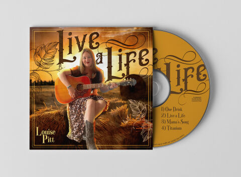
This portfolio showcase highlights the commercial print layout and graphic architecture for the Louise Pitt Live a Life Music EP Cover Design. The objective was to design a highly authentic, warm and narrative driven album cover that bridges acoustic country folk heritage with premium physical packaging, instantly communicating raw musical storytelling, organic instrumentation and a clear product identity for retail distribution.
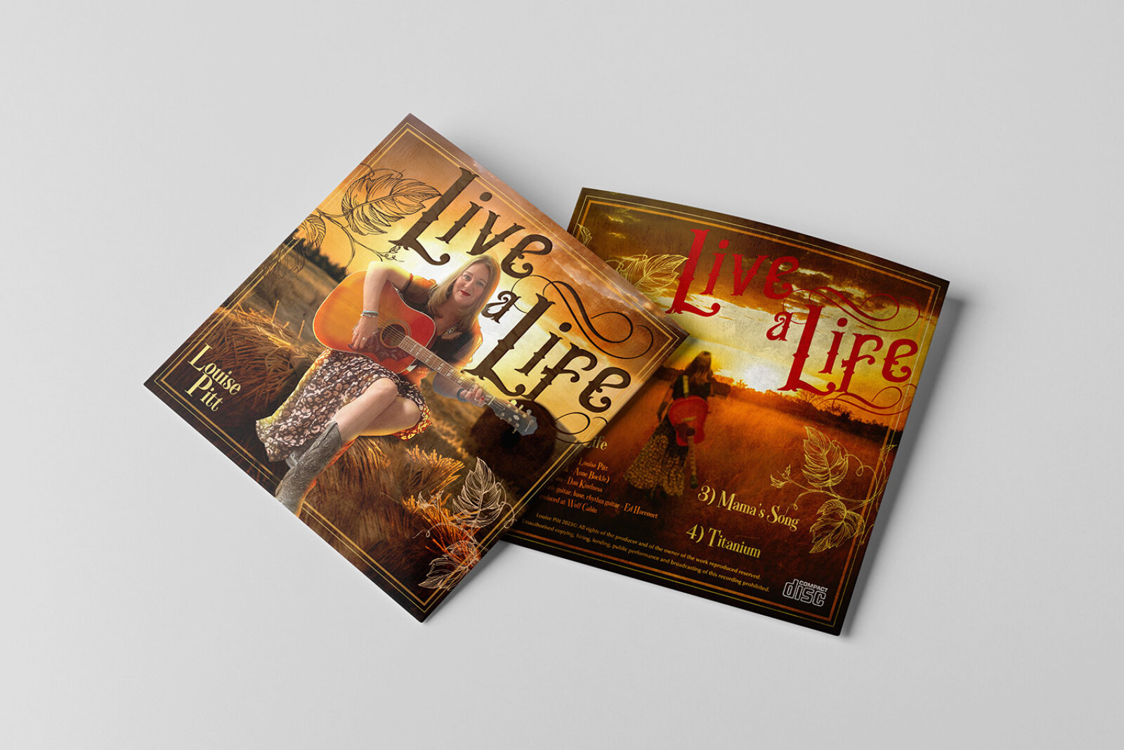
Design & Requirements Breakdown
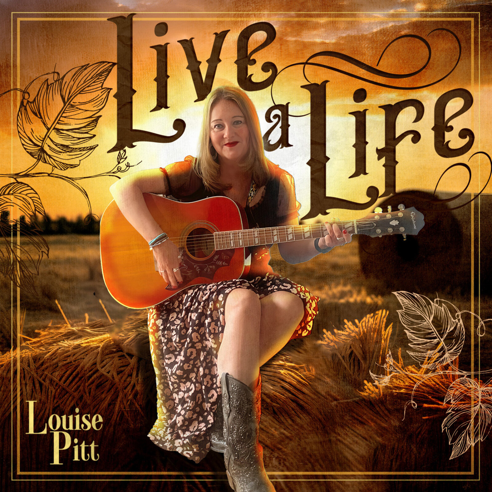
Visual Symbolism – The design features a stunning, atmospheric lifestyle photograph of artist Louise Pitt sitting atop harvested hay bales at dusk, cradling an acoustic guitar as the primary visual anchor. This rustic theme is beautifully layered into the graphic architecture via organic leaf sketch overlays framing the margins and a warm, golden hour sunset background. The aesthetic seamlessly transitions onto the physical disc surface, which utilises a rich golden ochre texture to mirror the rural landscape, visually reinforcing a sense of down to earth authenticity, lyrical depth and acoustic warmth.
Typographic Architecture – A highly stylised, custom vintage serif font with elegant flowing flourishes blocks out the primary album title "Live a Life" across the upper half of the canvas, instantly evoking a classic Americana or roots music aesthetic. In the lower left margin, the artist's name "Louise Pitt" is balanced in a refined, high contrast gold serif font. The physical CD face features an ultra legible, classic serif typeface listing the EP's track list including "One Drink," "Live a Life," "Mama's Song," and "Titanium"—alongside an official "COMPACT DISC DIGITAL AUDIO" logo block to maintain strict retail manufacturing standards.
Premium Presentation – The promotional artwork is presented in a premium 3D retail packaging mock up perspective showcasing a dual unit layout resting on a neutral, smooth grey studio backdrop. The square cardboard slipcase sleeve sits completely flat, elegantly flanked by the physical printed CD peeking out from behind the right margin to showcase complete design continuity, crisp manufacturing edge cuts and realistic material depth.
Strategic Colour Choice – A sophisticated, country inspired palette of rich amber gold, deep sepia browns and warm ochre forms the core brand signature elements and graphic background panels, heavily contrasted by the dark, high contrast typography contours. This distinct, earth toned palette evokes immediate nostalgic warmth, rustic organic logic, and a highly recognisable artist identity that stands out beautifully in a physical record shop display or digital streaming storefront.
Target Audience Focus – The structured, heritage first layout is tailored to engage dedicated acoustic music collectors looking for authentic physical releases, country and folk audio enthusiasts seeking immersive visual storytelling and retail music shoppers demanding a transparent, highly professional package design that beautifully honors the artist's singer songwriter roots.