
Light Oaks Workshop Business Stationery
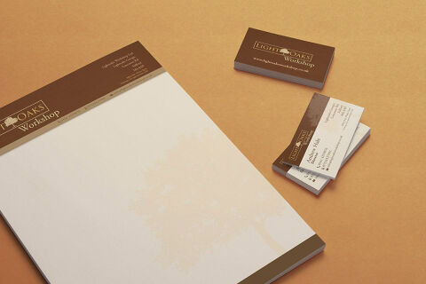
This portfolio showcase highlights the corporate identity layout and print asset coordination for Light Oaks Workshop business stationery. The objective was to design an organic, highly structured, and grounded business stationary pieces that bridge artisan craftsmanship with professional corporate credibility, instantly communicating reliable trade expertise, premium raw materials, and heritage grade woodwork.
Design & Requirements Breakdown
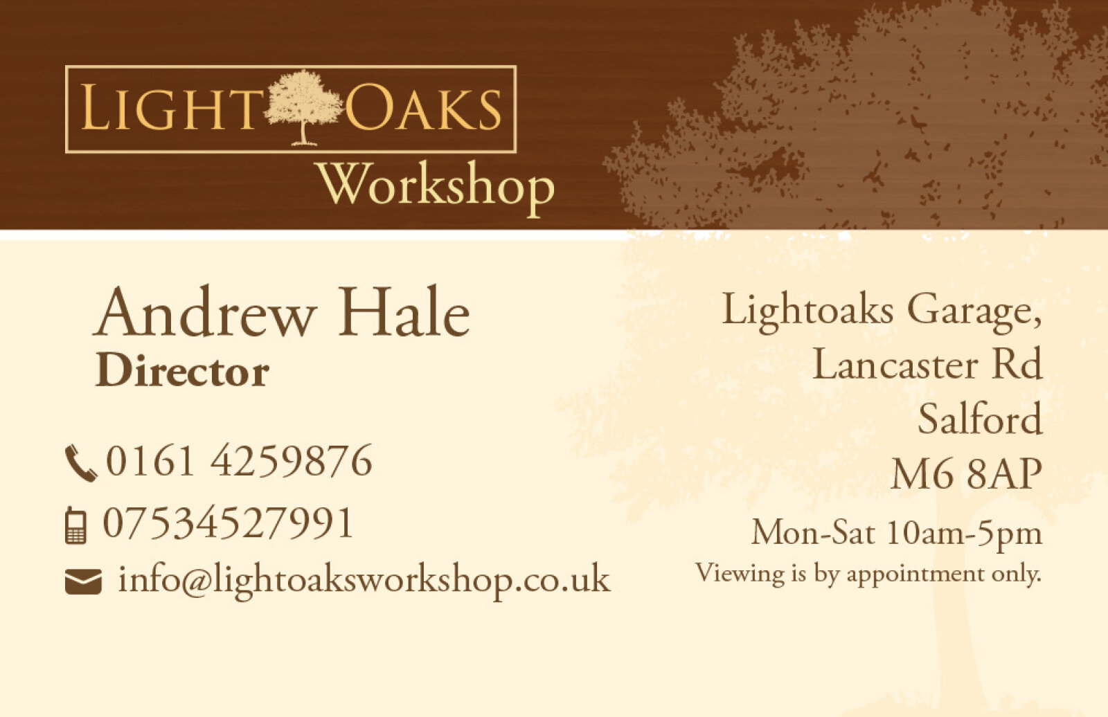
Visual Symbolism – The design features a beautifully detailed, soft tone silhouette illustration of a mature oak tree that spans across the lower right quadrant of the letterhead as a delicate watermark. This natural imagery is paired with a clean, boxed corporate tree emblem flanking the brand name, visually reinforcing organic sustainability, meticulous carpentry, and a rock solid structural foundation.
Typographic Architecture – A classic serif display typeface presents the name "LIGHT OAKS Workshop" with traditional weight and timeless character. On the executive business cards, this primary branding is balanced by a clean sans-serif typeface that methodically maps out individual credentials such as the name "Andrew Hicks" and title "Director" alongside essential contact coordinates and address records, maintaining a lightweight information hierarchy optimised for quick reading.
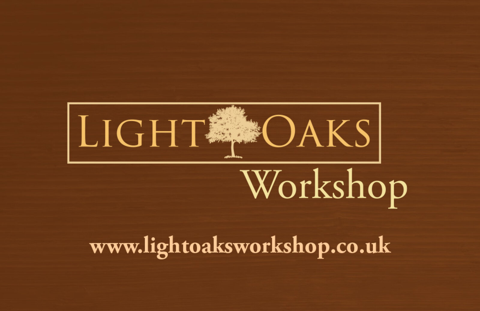
Premium Presentation – The stationery collection is showcased in a premium, 3D stacked print mock up composition resting on a warm, textured kraft paper style backdrop. This angled perspective highlights a thick pad of official letterhead alongside two distinct stacks of business cards displaying both the solid, full bleed corporate backing and the structured front facing contact details demonstrating a polished suite optimised for carpentry estimates, invoice billing, and official trade correspondence.
Strategic Colour Choice – A sophisticated, earth toned palette of deep forest brown and rich tan accents forms the core brand canvas and header blocks, heavily contrasted by a soft cream white paper writing canvas and crisp white typography. This natural, high contrast colour scheme evokes immediate professional trust, timeless environmental reliability, and an upscale, boutique workshop identity.
Target Audience Focus – The grounded, craft first layout is tailored to engage private homeowners looking for premium bespoke furniture commissions, commercial contractors seeking high end architectural woodwork partners, and retail clients demanding authentic, artisanal build quality.