
Lay Down Your Arms For The Sake Of Humanity By Steve Colley Music Single Cover Design
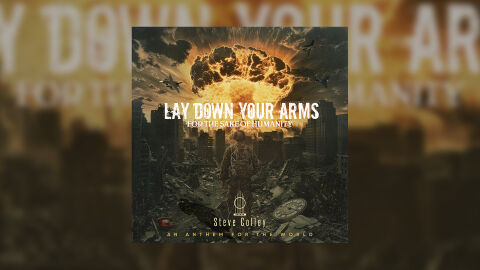
This portfolio showcase highlights the commercial print layout and graphic architecture for the Steve Colley Lay Down Your Arms (For The Sake Of Humanity) Music Single Cover Design. The objective was to design a highly atmospheric, emotionally raw, and cinematic CD single cover that bridges powerful protest music themes with premium packaging, instantly communicating a message of global urgency, apocalyptic destruction and a striking product identity for physical and digital distribution.
Design & Requirements Breakdown
Visual Symbolism – The design features a devastating, apocalyptic war zone at the exact epicenter of the layout, serving as the core visual narrative. A lone soldier stands amidst crumbling, debris strewn city ruins, facing a monumental, highly detailed nuclear mushroom cloud erupting violently into the sky. Military fighter jets streak across the smoke filled atmosphere, adding to the visual chaos. This evocative, intense imagery beautifully anchors the graphic architecture, seamlessly reinforcing the single's underlying themes of peace, the cost of conflict and a deeply emotional human plea for global unity.
Typographic Architecture – The layout utilises a bold, high contrast typography hierarchy positioned across the upper center quadrant to anchor the release identity. The main title "LAY DOWN YOUR ARMS" is rendered in a prominent, heavy sans-serif typeface, immediately commanding attention. Directly below, the crucial connecting message "FOR THE SAKE OF HUMANITY" is split into a smaller, tightly spaced sans-serif layout. The artist's name "Steve Colley" rests near the lower baseline in a stylised cursive font, followed by the descriptive subtitle "AN ANTHEM FOR THE WORLD" in clean, spaced block lettering. This deliberate typographic alignment preserves high fidelity readability while establishing a powerful, thought provoking branding signature.
Premium Presentation – The promotional artwork is presented in a high fidelity digital preview composition, showcasing the square cover art format beautifully framed against a warm, heavily blurred studio backdrop that mirrors the fiery orange hues of the central design. This focused presentation layout emphasises the sharp print resolution, the complex textures of the smoke and dust clouds, and the intricate, gritty details of the urban ruins, offering a highly tactile and professional preview of a completed commercial music release ready for digital audio distribution.
Strategic Colour Choice – A sophisticated, moody palette of fiery oranges, brilliant yellows, and deep, ash toned charcoals forms the core brand signature canvas, creating an intense, cinematic atmosphere. This fiery, dramatic base is heavily balanced by the stark white tones of the main title typography. This distinct, high contrast colour configuration injects an immediate sense of heat, destruction, and narrative gravity, ensuring the artwork cuts through competing digital storefronts and streaming interfaces.
Target Audience Focus – The structured, concept first layout is meticulously tailored to engage listeners of anthemic, socially conscious, and emotionally driven music, enthusiasts who appreciate intense, narrative focused visual art, and digital music consumers demanding a transparent, highly professional package design that beautifully honors the track's raw, impactful message.