
Kre Alkalyn Bottle Visual Design
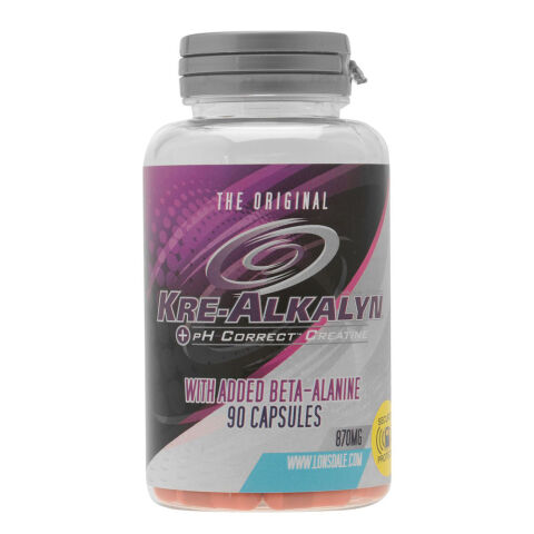
This portfolio showcase highlights the packaging design and bottle label execution for Lonsdale London Kre-Alkalyn pH Correct Creatine. The objective was to design a high potency, performance driven supplement bottle label that bridges sports nutrition authority with advanced alkaline science, instantly communicating buffered creatine delivery, added endurance support, and muscle strength benefits.
Design & Requirements Breakdown
Visual Symbolism – The design features a dynamic, multi swirl centerpiece emblem surrounded by half toned dot patterns, set against a rich plum purple backdrop. A bright cyan base accent curve frames an integrated "Secure Seals Protected" security badge, visually conveying scientific precision, formula purity, and tamper evident quality assurance.
Typographic Architecture – A dominant, metallic chrome display font commands primary shelf attention with "KRE-ALKALYN," crowned by "THE ORIGINAL" header and anchored by a high visibility pink highlight block detailing "WITH ADDED BETA-ALANINE" and a clear "90 CAPSULES" count for effortless feature recognition.
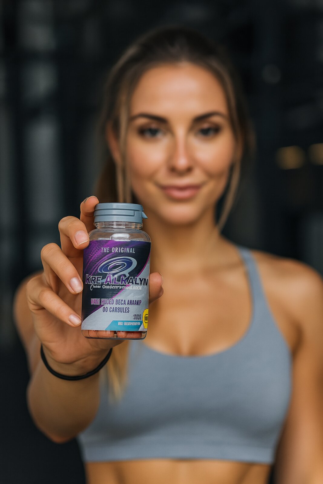
Premium Presentation – The full wrap contoured label adapts seamlessly around a clear PET container topped with a ribbed safety cap, allowing the vibrant orange capsules inside to show through at the base while leaving clean, uncluttered space for dosage guidelines and online verification call outs.
Strategic Colour Choice – Deep plum purple is combined with electric pink accents, bright cyan blue, crisp white typography, and silver chrome finishes, creating a high contrast palette that signals energetic strength training, advanced pH-buffering technology, and a modern athletic identity.
Target Audience Focus – The clinical, high performance layout is tailored to engage bodybuilders, strength athletes, and fitness enthusiasts seeking non bloating creatine formulas with enhanced muscle endurance and rapid pre workout absorption.