
Knightsbridge Whisky Stones Packaging Design
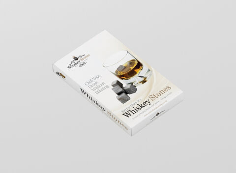
This portfolio showcase highlights the packaging design and gift box presentation for Knightsbridge Whiskey Stones. The objective was to design a clean, high end gift box that bridges classic spirits heritage with modern barware sophistication, instantly communicating neat temperature control, zero spirit dilution, and premium soapstone craftsmanship.
Design & Requirements Breakdown
Visual Symbolism – The design features a crisp white canvas paired with a refined crest emblem, framed by a high resolution hero photographic render of a filled rock glass alongside polished soapstone cubes. This elegant composition immediately conveys luxury mixology, uncompromised spirit flavour, and elevated home bar presentation.
Typographic Architecture – A classic serif display font delivers the core "Whiskey Stones" product identity with timeless British prestige, perfectly balanced by high contrast secondary serif call outs ("Chill Your Drink Without Diluting" and "Better Than Ice") for immediate feature recognition and gift appeal.
Premium Presentation – The sleek rectangular gift box structure features full bleed side panel branding, ensuring clear visual identification when stocked on retail shelves, display bars, or e-commerce hero showcases. The multi angle layout smoothly integrates key feature specifications and storage pouch details around the perimeter.
Strategic Colour Choice – Crisp stark white forms a clean, premium baseline, accented by warm amber whiskey tones, slate gray stone textures, and subtle charcoal typography to evoke pure craftsmanship, chill efficiency, and a sophisticated, high end aesthetic.
Target Audience Focus – The sophisticated layout is tailored to engage whiskey connoisseurs and spirit enthusiasts who demand undiluted flavour, luxury barware collectors, and gift shoppers seeking a refined, premium accessory for home bars.