
Kiss Me Slowly By Dj Smc Music Single Cover Design
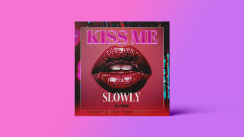
This portfolio showcase highlights the commercial print layout and graphic architecture for the DJ SMC Kiss Me Slowly Music Single CD Cover Design. The objective was to design a highly atmospheric, alluring, and modern single cover that bridges contemporary electronic, dance and pop music sensibilities with premium physical and digital packaging, instantly communicating a late night sensual energy, textured depth, and a striking product identity for retail and digital distribution.
Design & Requirements Breakdown
Visual Symbolism – The design features a realistic, high gloss image of full, deep red lips slightly parted at the exact epicenter of the layout, serving as the core visual narrative. This evocative, bold imagery instantly establishes the single's themes of intimacy, romance, and slow tempo allure. The central lips are beautifully framed within a clean, metallic square border, which is layered into the graphic architecture over a darker, atmospheric background featuring blurred bokeh light effects and vertical neon digital rain textures. This visual configuration seamlessly reinforces a premium, nightlife inspired electronic music aesthetic.
Typographic Architecture – A stylised, high contrast serif font blocks out the main title phrase "KISS ME" across the upper third of the inner frame, rendered in a striking, neon pink gradient with a subtle white inline effect. Directly beneath the central image, the connecting word "SLOWLY" is displayed in a clean, elegant white serif typeface, followed by the artist's name "DJ SMC" in a minimalist, sharp sans-serif font centered at the base. This deliberate typographic alignment creates a lightweight information hierarchy optimised for effortless reading across digital streaming thumbnails while maintaining a distinct, club ready branding signature.
Premium Presentation – The promotional artwork is presented in a high fidelity digital and print preview composition, showcasing the square cover art upright and centered against a vibrant, split pink-to-purple gradient studio backdrop. This focused vignette layout emphasizes the sharp print resolution, the rich texture of the central gloss lips, and the subtle floor shadow casting, offering a highly tactile, professional preview of a completed commercial music release ready for digital audio distribution or physical package manufacturing.
Strategic Colour Choice – A sophisticated, moody palette of deep crimson red, neon pink, and electric violet forms the core brand signature canvas, heavily contrasted by the crisp white tones of the lower typography. This distinct, high energy colour palette evokes immediate nightlife intrigue, house/pop authenticity, and a mature, polished visual identity that effortlessly cuts through competing digital storefronts and streaming platform playlists.
Target Audience Focus – The structured, concept first layout is meticulously tailored to engage dedicated electronic, dance, and modern pop music listeners looking for polished commercial releases, club DJs seeking striking cover art for curation and music consumers demanding a transparent, highly professional package design that beautifully honours the single's sensual and atmospheric themes.