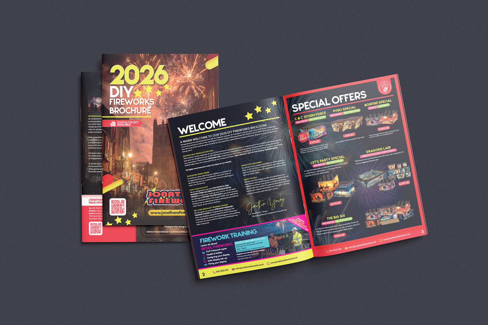
Jonathan's Fireworks DIY Fireworks Brochure Design
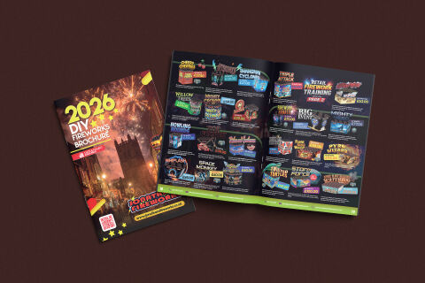
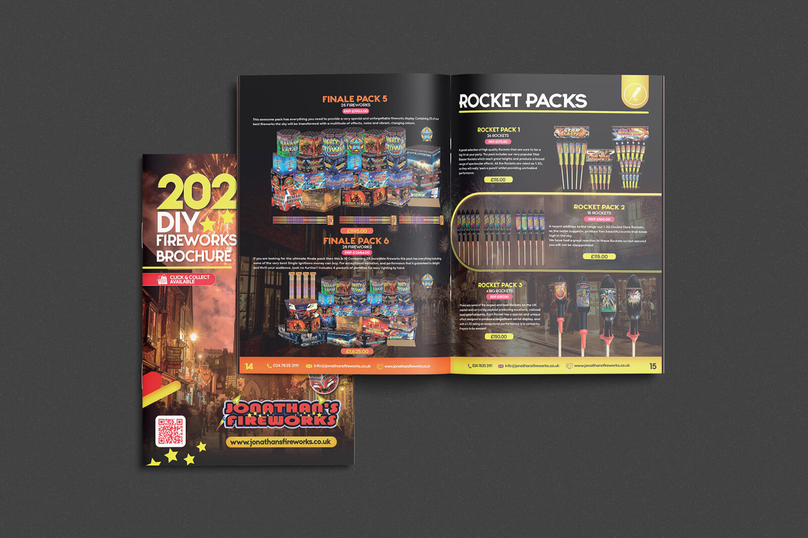
This portfolio piece highlights the high energy art direction and complex retail layout architecture designed for Jonathan's Fireworks' multi-page DIY product catalogue. The design objective was to build an immersive, celebratory print and digital brochure that captures the excitement, colour and spectacle of a live fireworks display. The visual strategy relies on a heavily stylised, grid based interface system that manages an extensive product range organising varying item sizes, pricing structures and hazard data into a vibrant, easily navigable consumer tool optimised for retail storefronts, seasonal pop-ups and online downloads.
Design & Requirements Breakdown
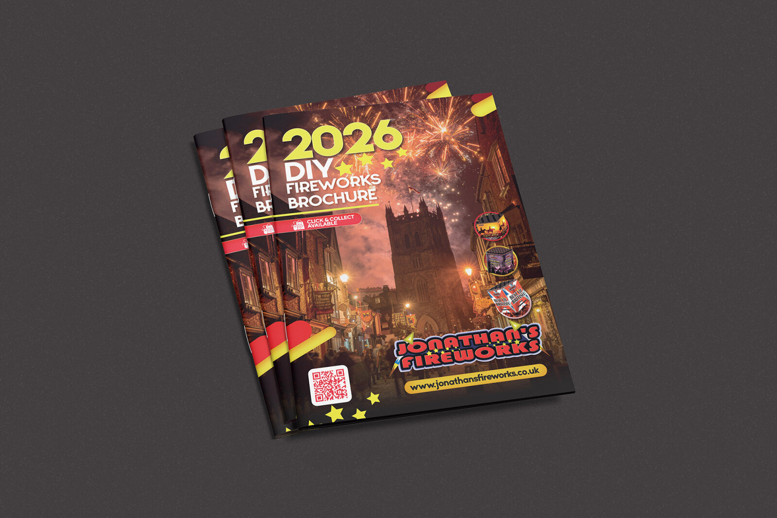
Visual Symbolism – The front cover layout features a cinematic photograph of a historic church tower illuminated by a vibrant, exploding gold firework finale. This powerful image instantly establishes seasonal warmth, community gathering, and explosive entertainment, while the interior spread uses a bright, continuous lime green footer strip and custom shaped product cards to symbolise organised variety, dynamic energy and structured choice, all beautifully showcased against an expansive, neutral deep chocolate backdrop.
Typographic Architecture – A bold, blocky sans serif display typeface gives the main title "2026 DIY FIREWORKS BROCHURE" an urgent, festive identity, beautifully paired with a playful 3D comic style logo for "Jonathan's Fireworks." On the interior spreads, the typography shifts to an intricate, colour coded price tagging system, using custom rounded oval shapes and neon gradients to lock in high impact product names (such as "Space Monkey," "Pyro Wizard," and "Twisted Turtles") and bold price tags (like £40.00 or £100.00) to guarantee absolute legibility amidst busy retail graphics.
Premium Presentation – The marketing collateral is displayed in a high fidelity, dual element print mock up showcasing both the portrait front cover and an open, multi-page interior spread. This layout style provides a thorough view of the user journey, demonstrating how the dark, atmospheric energy of the outdoor cover transitions smoothly into a highly functional product matrix, proving that retail sales booklets can achieve a professional, commercial grade finish.
Strategic Colour Choice – The colour palette utilises an immersive, deep midnight black background for the interior pages, allowing the high resolution product packaging renders and explosive colourful graphics to pop off the page. The deliberate addition of electric blues, vibrant magentas, fiery oranges and a foundational neon lime green creates a high contrast visual roadmap, directing the consumer’s eye to active pricing tiers, bundle packs and safety recommendations without overwhelming the overall composition.
Target Audience Focus – The structured, product first layout is meticulously tailored to engage retail consumers planning home celebrations, event organisers sourcing seasonal displays, and business stockists seeking a professional wholesale leave behind. It targets buyers demanding an authentic, exciting design that honours the celebratory thrills of pyrotechnics while delivering a clear, highly secure and intuitive purchasing journey.