
Iso 27001 Book Cover Design
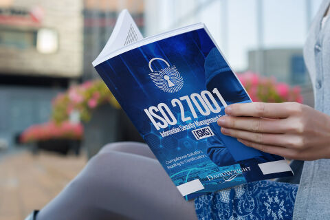
This portfolio showcase highlights the commercial cover illustration and print jacket layout for the ISO 27001 Information Security Management Systems [ISMS] Book. The objective was to design a highly professional, technically authoritative and striking book cover that bridges corporate data governance with modern digital design, instantly communicating cyber-security precision, enterprise-grade reliability, and a structured compliance roadmap.

Design & Requirements Breakdown
Visual Symbolism – The design features a stylised, central icon of a high security padlock overlaid with complex fingerprint biometric circuitry, serving as the primary visual anchor on the front panel. This technological theme is beautifully mirrored via a hooded cyber operative figure working on a terminal in the right foreground, while the entire canvas is wrapped in an immersive background of dark digital grids and abstract network hex nodes, visually reinforcing encryption protocols, threat mitigation and corporate network transparency.
Typographic Architecture – A bold, heavy sans-serif display typeface blocks out the primary acronym "ISO 27001" across the center of the jacket, paired with a matching weighted sans-serif layout reading "Information Security Management Systems [ISMS]" directly underneath. Along the lower margin, a clean white font presents the sub tagline, "Compliance Solution, Path to Certification," balanced neatly above the author’s name "DAVID WRIGHT" to keep a lightweight information hierarchy optimised for effortless reading by corporate professionals.
Premium Presentation – The promotional asset is presented in a premium 3D lifestyle book mock up perspective showcasing a reader holding the volume wide open, revealing both the front canvas, the detailed spine architecture, and the informative reverse summary page. This realistic composition emphasises mass print production quality, authentic paperback page block volume, and real world handling depth, offering a highly tactile preview of an enterprise trade textbook touch point.
Strategic Colour Choice – A sophisticated, technology first palette of deep slate blue, electric cyan and stark white forms the core brand signature jacket, heavily punctuated by bright digital light nodes and glowing lock graphics. This distinct, high contrast palette evokes immediate corporate trust, compliance logic, and a highly recognisable data security brand identity that stands out in a professional boardroom, corporate library or online marketplace display.
Target Audience Focus – The structured, compliance first layout is tailored to engage corporate IT security officers seeking an authoritative implementation framework, enterprise network administrators preparing for security audits and business executives demanding a transparent, highly professional guide to protecting critical organisational data assets.