
Idle by System Sync - Single Cover Design
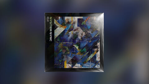
This portfolio design piece highlights the commercial print layout and graphic architecture for System Sync’s "Idle" music CD single release. The objective was to design a highly atmospheric, complex, and futuristic album cover that captures a high energy electronic, industrial, or synth wave aesthetic. The layout instantly communicates an intricate digital landscape, complex technical layering and a striking product identity optimised for physical retail distribution and modern streaming storefronts.
Design & Requirements Breakdown
Visual Symbolism - The design features a complex, abstract mosaic of geometric shards, overlapping glitch textures and fragmented digital architectural lines, serving as the core visual narrative. The chaotic yet structured arrangement of overlapping planes evokes a sense of systemic motion frozen in time, perfectly mirroring the concept of a system running "idle." This evocative focal imagery seamlessly reinforces themes of digital overload, structured technology and an immersive, multi-layered electronic music journey.
Typographic Architecture - The layout incorporates a bold, vertically integrated typography system positioned cleanly inside a solid black spine/border element on the left quadrant to manage the single's identity. The artist's name "SYSTEM SYNC" is rendered in a custom, futuristic stencil-style sans-serif display typeface with a subtle digital glow effect. Directly below it, the track title "IDLE" is set in a clean, minimalist white font. This deliberate vertical layout decision mirrors technical hardware or server rack labeling, establishing a clear information hierarchy that ensures high legibility on physical shelving and digital storefront thumbnails.
Premium Presentation - The promotional artwork is presented in a high fidelity physical product mock up, showcasing the square single cover art encased under a realistic, glossy cellophane shrink wrap overlay with authentic plastic crinkles and light reflections. The composition is framed precisely against a heavily blurred studio vignette backdrop that echoes the deep blue and purple ambient tones of the central artwork. This focused presentation highlights the tactile quality of a finished physical release, offering a professional preview ready for physical manufacturing or digital audio distribution campaigns.
Strategic Colour Choice - A sophisticated, deep palette of electric blues, cybernetic teals, and dark indigo forms the primary digital canvas, establishing a moody and late night aesthetic. This rich foundation is powerfully enlivened by sharp, geometric accents of vibrant neon yellow, crisp whites, and warm orange slashes cutting through the composition. This distinct colour configuration injects an immediate sense of artificial energy, balancing cold industrial tech grit with a highly polished, contemporary visual tone that easily cuts through crowded store shelves.
Target Audience Focus - The structured, concept first layout is meticulously tailored to engage fans of electronic, cyberpunk and alternative synth music looking for deep complex textures, physical music collectors seeking premium vinyl or CD packaging and retail music consumers demanding a transparent, highly professional package design that beautifully honours a dynamic electronic single release.