

Ice Rink Tarps Promotion Discount Flyer Design
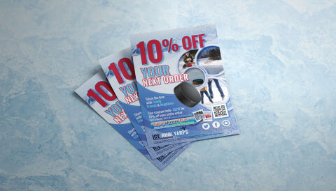
This portfolio showcase highlights the marketing layout and promotional print asset design for the Ice Rink Tarps promotion discount flyer. The objective was to design a highly professional, striking, and seasonal customer retention flyer that bridges heavy duty winter utility with direct to consumer digital design, instantly communicating commercial reliability, winter sports authority and a streamlined digital conversion path for repeat customers.
Design & Requirements Breakdown
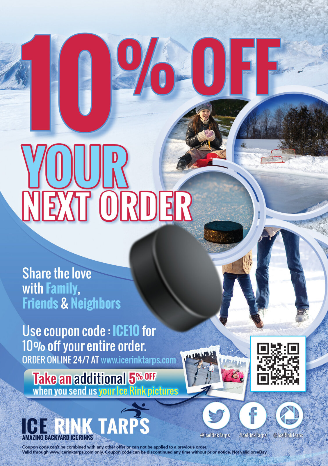
Visual Symbolism – The design features a realistic 3D render of a hockey puck that anchors the central canvas, establishing an immediate connection to ice rink sports and recreation. This winter theme is beautifully echoed via a series of circular, snow framed micro photography showcases in the upper right quadrant depicting active ice skaters, paired with an immersive background texture of cracked ice and deep blue snow drifts that sweep into the lower margins, visually reinforcing sub zero performance, material durability and brand transparency.
Typographic Architecture – An ultra bold, heavy impact display typeface blocks out the primary promotional message "10% OFF YOUR NEXT ORDER" across the header, utilising a vibrant crimson red and cyan drop shadow to achieve maximal contrast against the icy background canvas. Below the main incentive, a clean sans-serif typeface maintains a precise left alignment for social sharing copy and coupon guidelines, while a dedicated, high visibility digital QR code block is anchored alongside social media coordinates to keep a lightweight information hierarchy optimised for quick mobile scanning.
Premium Presentation – The promotional collateral is presented in a premium 3D print mock up perspective showcasing a fanned, overlapping stack of printed flyer sheets resting at a dynamic angle on a stylised, light blue marble studio backdrop. This composition accentuates realistic page shadowing, authentic paper edge definitions and repetitive brand exposure, offering a highly tactile and immersive preview of a completed e-commerce packaging insert.
Strategic Colour Choice – A sophisticated, seasonal palette of deep ice blue, bright cyan, and stark white forms the core background canvas, heavily punctuated by high visibility pops of crimson red for the primary discount metrics. This distinct, high contrast palette evokes immediate winter sports association, industrial utility logic and an energetic, highly recognisable recreational hardware brand identity.