
Hooked On Swing Cd Cover Design
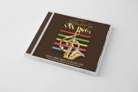
This portfolio showcase highlights the commercial print layout and graphic architecture for the Hooked on Swing CD Cover Design. The objective was to design a highly sophisticated, classic and energetic album cover that bridges the golden era of big band jazz with modern retail packaging, instantly communicating brass precision, rhythmic nostalgia and a clear product identity for retail distribution.
Design & Requirements Breakdown
Visual Symbolism – The design features a beautifully rendered, metallic golden saxophone seamlessly integrated with a matching golden treble clef at the exact centre of the canvas, serving as a powerful visual anchor. This musical theme is layered into a dynamic neon graphic architecture, with a stacked horizontal grid of glowing red, green, pink and cyan neon light tubes radiating behind the instrument. This visual layout perfectly bridges the classic, high class brass instrumentation of big band swing with an energetic, glowing nightlife aesthetic.
Typographic Architecture – An elegant, flowing cursive script blocks out the word "Hooked on" in a reflective gold finish. Dominating the upper centre title section, the word "SWING" is rendered in a heavy, bold, 3D-extruded sans-serif display typeface with metallic gold gradients. Along the lower margin, a clean, high contrast white sans-serif font cleanly structures the secondary descriptive tags, "A MUSICAL JOURNEY THROUGH JAZZ, BIG BAND & SWING" and "THE ORIGINAL RECORDINGS PLUS BONUS TRACKS," to keep a lightweight information hierarchy optimised for effortless reading.
Premium Presentation – The promotional artwork is presented inside a high fidelity retail jewel case mock up perspective, showcasing the booklet layout sitting behind a realistic clear plastic tray and a dark brown spine strip. The presentation is set at an angled, perspective orientation on a neutral, smooth white studio backdrop, capturing crisp plastic edge cuts and subtle surface shadows to offer a highly tactile and retail ready preview of a completed physical media product.
Strategic Colour Choice – A sophisticated, performance first palette of deep chocolate brown forms the core background canvas, heavily punctuated by the rich metallic golds of the typography and central saxophone. This deep, warm background allows the vibrant, energetic pops of neon red, green, pink and cyan to pop dynamically off the page. This distinct palette evokes immediate nostalgic warmth, high class lounge logic and a highly recognisable compilation identity that commands attention on store shelving or digital audio marketplace displays.
Target Audience Focus – The structured, heritage first layout is tailored to engage dedicated jazz and big band music collectors looking for authentic classic recordings, nostalgic audio enthusiasts seeking high energy swing compilation albums, and retail music shoppers demanding a transparent, highly professional package design that beautifully honors a historic musical genre.