
Hooked On Proms Classics Cd Cover Design
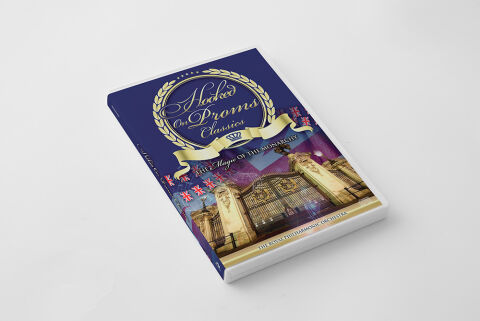
This portfolio showcase highlights the commercial print layout and graphic architecture for the Hooked on Proms Classics: Magic of the Monarchy Orchestral Compilation CD Cover Design. The objective was to design a highly atmospheric, regal and celebratory album cover that bridges prestigious British symphonic heritage with premium physical packaging, instantly communicating a sense of majestic scale, national pride and a striking product identity for retail distribution.
Design & Requirements Breakdown
Visual Symbolism – The design features a majestic architectural illustration of Buckingham Palace's iconic golden gates at the lower half of the layout, serving as the core visual narrative. Flanking the historic gates are rows of waving Union Jack flags, which lead the eye upward toward a prominent, gold embossed laurel wreath emblem framing a royal crown motif. This juxtaposition of grand institutional landmarks with traditional regal iconography beautifully reinforces themes of royal pageantry, the vibrant atmosphere of the Proms and a deeply rooted British musical heritage.
Typographic Architecture – The layout utilises an elegant, multi layered font hierarchy to manage the release identity across the upper royal blue quadrant. A graceful, flowing cursive script blocks out the main series title "Hooked on Proms Classics" inside the central gold wreath. Directly beneath, the connecting subtitle "THE Magic OF THE MONARCHY" is rendered in a sharp, high contrast serif typeface, while the lower border neatly attributes the performance to "THE ROYAL PHILHARMONIC ORCHESTRA" in a clean, all caps sans-serif block. This deliberate typographic alignment preserves high fidelity readability while establishing a distinct, ultra premium branding signature.
Premium Presentation – The promotional artwork is presented in a high fidelity digital and print preview composition, displaying the thick multi disc jewel case or booklet angled precisely against a clean, neutral white studio backdrop. This focused mock up layout emphasises the sharp print resolution, the structural depth of the spine wrap, and the premium contrast against the white casing border, offering a highly tactile and professional preview of a completed commercial music release ready for physical package manufacturing.
Strategic Colour Choice – A sophisticated, patriotic palette of deep royal blue, brilliant metallic gold and rich crimson reds forms the core brand signature canvas. The intense blue background texture provides a regal foundation that allows the gold wreath and text elements to pop with clarity. This distinct, high contrast colour palette evokes immediate institutional prestige, historical authenticity and a mature visual identity that cuts through competing traditional orchestral and live compilation displays in physical and digital retail environments.
Target Audience Focus – The structured, concept first layout is meticulously tailored to engage classical music enthusiasts seeking timeless orchestral recordings, patrons of traditional British pageantry looking for definitive musical keepsakes, and retail shoppers demanding a transparent, highly professional package design that beautifully honours the grand, celebratory spirit of the Proms and the British Monarchy.