
Hooked on Jazz - Music Single Cover Design
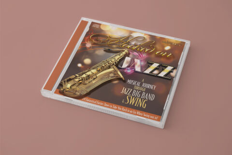
This portfolio piece highlights the vibrant art direction and high energy, era focused layout architecture for the single CD compilation, "Hooked on Jazz: A Musical Journey Through Jazz Big Band & Swing." The design objective was to build a glamorous, nostalgic cover art piece that perfectly encapsulates the lively, brass driven spirit of mid century big band jazz and swing music. The layout relies on polished, high contrast imagery and theatrical lighting effects to instantly establish a premium, celebratory tone, optimised for a strong commercial presence as both physical merchandise and digital streaming media.
Design & Requirements Breakdown
Typographic Architecture – The design uses a dynamic, multi-layered typographic layout anchored in a powerful hierarchy that draws the eye across the composition. The core series branding "Hooked on" is rendered in a luxurious, flowing gold script, which sweeps smoothly above the genre title. The word "JAZZ" is displayed in an oversized, custom three dimensional display typeface featuring marquee style inner lining that evokes the neon lit marquees of historic jazz clubs. The sub elements, "A Musical Journey Through" and "Jazz Big Band & Swing," utilise a balanced combination of structured, clean sans-serif typography and an elegant gold script to guarantee clear messaging without cluttering the visual space.
Premium Presentation – The promotional artwork is displayed as a high fidelity physical product mock up, positioning the front cover graphic inside a classic transparent plastic jewel case with a contrasting orange spine insert. The design includes a dedicated, clean typography banner running along the bottom margin, reading "20 Fantastical Fifties Tunes to Take You Back to an Era Where Swing was King!" This footer strip acts as a functional retail call out, ensuring key selling points are instantly visible to buyers while framing the central artwork within the physical plastic casing.
Strategic Colour Choice – The colour palette relies on a lavish, festive scheme of metallic golds, deep velvet charcoals and energetic pops of amber and copper, beautifully complemented by an out of focus bokeh background that mimics theatrical stage lighting. The polished gold treatment of the saxophone illustration mirrors the warmth of the script typography, creating a cohesive visual loop. The addition of a clean white outline around the main "JAZZ" lettering provides essential contrast, ensuring the title remains punchy and instantly legible even when scaled down to a small digital thumbnail.
Target Audience Focus – The historic, performance first layout is meticulously crafted to engage enthusiasts of mid century swing music, big band collectors looking for premium aesthetic physical packaging, and nostalgic music consumers demanding an authentic, highly polished design that honours traditional American jazz heritages and high energy musical storytelling.