
Hooked On Dance Hall Classics Cd Cover Design
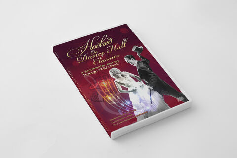
This portfolio showcase highlights the commercial print layout and graphic architecture for the Hooked on Dance Hall Classics: A Sentimental Journey Through 1940's Music Compilation CD Cover Design. The objective was to design a highly atmospheric, nostalgically elegant and dynamic album cover that bridges vintage big band swing heritage with premium physical packaging, instantly communicating a sense of romantic movement, wartime glamour and a striking product identity for retail distribution.
Design & Requirements Breakdown
Visual Symbolism – The design features a striking black and white photograph of a dancing couple dressed in classic 1940s formal attire, serving as the core visual narrative. The gentleman tips his top hat in mid-stride while guiding his partner, capturing the exuberant energy and sophisticated motion of a vintage dance hall. Swirling outward from beneath the dancers is a glowing, translucent golden musical staff woven with flowing neon notation trails. This unique juxtaposition of historical photography with vibrant, modern light paths beautifully reinforces themes of a timeless musical legacy and an immersive, celebratory audio journey.
Typographic Architecture – The layout utilises an elegant, multi layered font hierarchy to manage the release identity across the upper half of the composition. A graceful, flowing cursive script font blocks out the main title "Hooked on Dance Hall Classics," rendered with a brilliant metallic gold texture that echoes the warm lighting of the era. Directly beneath, the descriptive subtitle "A Sentimental Journey Through 1940's Music" is displayed in a clean, high contrast white sans-serif typeface. This deliberate typographic alignment creates an effortless information hierarchy optimised for maximum legibility on retail shelves and digital streaming platforms alike.
Premium Presentation – The promotional artwork is presented in a high fidelity digital and print preview composition, displaying a thick multi disc jewel case booklet angled precisely against a clean, neutral white studio backdrop. This focused mock up layout emphasises the sharp print resolution, the premium depth of the deep burgundy background canvas, and the seamless transition of the spine wrap layout, offering a highly tactile and professional preview of a completed commercial music release ready for manufacturing.
Strategic Colour Choice – A sophisticated, moody palette of deep velvet burgundy and rich wine tones forms the core brand signature canvas, providing an intense background texture that allows the design elements to pop. This warm, historic base is heavily energised by the radiant gold of the typography and the glowing sound wave particle paths. This deliberate colour configuration injects an immediate sense of cinematic intrigue, mid-century romance, and a mature visual identity that cuts through competing traditional compilation displays.
Target Audience Focus – The structured, concept first layout is meticulously tailored to engage dedicated nostalgia enthusiasts, big band and swing dance collectors looking for authentic physical releases, and retail music shoppers demanding a transparent, highly professional package design that beautifully honours the historic gravity and elegant romance of the 1940s dance hall generation.