

Hooked On Country Music Classics Cd Cover Design
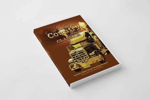
This portfolio piece highlights the commercial print layout and graphic architecture for the "Hooked On Country Music Classics: Country Music Road Trucking Medleys" compilation CD cover design. The objective was to design a highly atmospheric, rugged and visually striking album cover that bridges traditional open road Americana with a polished, high fidelity aesthetic. The layout instantly communicates a powerful and nostalgic driving rhythm, establishing a striking product identity optimized for physical retail distribution and digital music storefronts.
Design & Requirements Breakdown
Visual Symbolism - The design features a bold, graphic illustration of a classic American semi-truck barreling forward, serving as the core visual narrative. The grille of the truck subtly integrates a stylised treble clef musical symbol, while dramatic clouds of golden smoke or exhaust billow from the smokestacks in the background. This evocative focal imagery seamlessly reinforces themes of the open highway, the iconic trucking lifestyle and the steady, rolling momentum of classic country road medleys.
Typographic Architecture - The layout incorporates an elaborate, high contrast typography system carefully structured to manage the release's identity. The main title "Hooked On Country Music" is rendered in a sweeping, metallic gold script font in the upper third quadrant, introducing a premium look, while the word "CLASSICS" sits directly beneath it in a bold, chiseled serif style. At the base of the cover, the volume subtitle "Country Music Road Trucking Medleys" and artist billing "Performed by The Road Brothers" are clearly set in a clean, minimalist sans-serif font. This deliberate typographic alignment creates an effortless information hierarchy optimised for maximum legibility on physical retail shelves and small digital thumbnails alike.
Premium Presentation - The promotional artwork is presented in a high fidelity physical product mock up, showcasing the front cover and spine precisely fitted into a pristine white jewel case or multi-disc media shell. The crisp white edge of the physical casing offers a stark, professional frame against the warm, rich tones of the print artwork. This focused layout highlights the sharp print resolution, clean boundary cuts, and smooth colour gradients, delivering a highly tactile and retail ready preview of a completed commercial release.
Strategic Colour Choice - A sophisticated, warm palette of deep chocolate browns, rich caramels, and burnt ochre tones forms the primary photographic canvas, immediately evoking a nostalgic, dusty highway aesthetic. This earthy foundation is powerfully enlivened by bright, gleaming metallic golds and glowing amber highlights used across the truck illustration and primary typography. This distinct colour configuration injects an immediate sense of rugged energy, balancing traditional country grit with a polished, upscale visual tone that easily stands out across competitive store shelves.
Target Audience Focus - The structured, concept first layout is meticulously tailored to engage classic country and Americana enthusiasts, fans of traditional road trip tracks and audio collectors seeking high quality themed anthologies. The design satisfies retail music consumers demanding a transparent, highly professional package design that beautifully honours a high energy, classic country musical journey.