
Hooked On Classics Return To The Classics Cd Cover Design
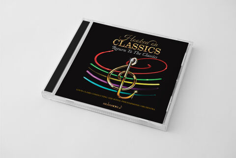
This portfolio showcase highlights the commercial print layout and graphic architecture for the Hooked on Classics: Return To The Classics Orchestral Compilation CD Cover Design. The objective was to design a highly atmospheric, visually striking and high energy album cover that bridges prestigious symphonic heritage with a vibrant, modern crossover aesthetic, instantly communicating a sense of grand performance, dynamic musical revival, and a premium product identity for retail distribution.
Design & Requirements Breakdown
Visual Symbolism – The design features a bold, metallic gold treble clef at the exact epicenter of the layout, serving as the core visual narrative and a timeless symbol of musical mastery. Radiating dynamically from behind this elegant center icon are sweeping, multi coloured neon ribbon paths in brilliant shades of crimson red, lime green, magenta and cyan that arc gracefully across a deep piano black canvas. This strategic juxtaposition of traditional classical music notation with futuristic, electric light trails beautifully reflects the album’s thematic identity breathing fresh, modern energy into legendary orchestral arrangements.
Typographic Architecture – The layout utilises an elegant, multi layered typography hierarchy to manage the prominent release credits. A graceful cursive script spells out "Hooked on", leading seamlessly into a dominant, high contrast serif font block for "CLASSICS", rendered in a luxurious gold texture. Directly beneath, the series title "Return To The Classics" is stylised in a clean, italic serif typeface, while the conductor and orchestral credits highlighting Louis Clark and the Royal Philharmonic Orchestra are neatly arranged in a sharp, lightweight serif block at the base. This deliberate typographic alignment ensures immediate legibility on streaming platforms and physical shelves alike, maintaining a highly professional and refined packaging signature.
Premium Presentation – The promotional artwork is presented in a high fidelity digital and print preview composition, displaying the square jewel case booklet angled precisely against a clean, neutral grey studio backdrop. This focused mock up layout emphasises the sharp print resolution, the rich depth of the solid black background canvas, and the authentic structural reflections of the clear plastic casing, offering a highly tactile and professional preview of a completed commercial music release ready for physical package manufacturing or digital audio distribution.
Strategic Colour Choice – A sophisticated foundation of deep piano black forms the core brand signature canvas, providing an intense background contrast that allows the primary design elements to pop with maximum clarity. This dark base is heavily energised by a brilliant spectrum of neon light trails, pulled together by the warm luxury of the metallic gold typography. This deliberate colour configuration injects immediate cinematic movement, balancing traditional symphonic prestige with an accessible, high energy visual tone that commands attention in physical and digital retail environments.
Target Audience Focus – The structured, concept first layout is meticulously tailored to engage classical music enthusiasts looking for refreshing modern interpretations, crossover pop symphonic collectors seeking dynamic audio experiences, and retail music shoppers demanding a transparent, highly professional package design that beautifully honors legendary compositions while celebrating an exciting orchestral legacy.