
Hooked On Classics 3D Cd Packaging
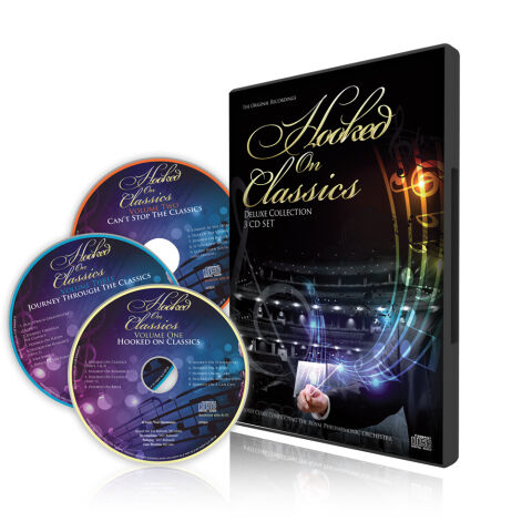
This portfolio showcase highlights the commercial print layout, disc surface typography, and 3D structural packaging architecture for the Hooked on Classics: Deluxe Collection 3-CD Box Set. The objective was to design a highly atmospheric, visually prestigious and immersive multi disc package that bridges legendary symphonic heritage with premium retail distribution, instantly communicating orchestral grandeur, a massive content value and a striking product identity for collectors.
Design & Requirements Breakdown
Visual Symbolism – The design features a dramatic, low angle photographic background of a majestic, multi tiered concert hall at the lower half of the main casing, serving as the core visual narrative. In the foreground, a conductor’s hand emerges holding a baton, unleashing a vibrant, swirling vortex of electric blue and violet light paths that morph into flowing musical staves and glowing notes. This powerful juxtaposition of traditional orchestral performance with dynamic light energy beautifully encapsulates the collection's thematic essence reigniting timeless classical masterworks with high octane, modern crossover production.
Typographic Architecture – The layout utilises an elegant, multi layered font hierarchy to manage the collection's comprehensive release details. A graceful, sweeping cursive script spells out "Hooked on" across the upper half of the frame, flowing into a prominent, high contrast serif font block for "CLASSICS," rendered in a polished metallic gold gradient. Directly below, the product tier "DELUXE COLLECTION / 3 CD SET" is stylised in a clean, understated sans-serif typeface, while the conductor and orchestral credits are neatly arranged at the baseline. This deliberate typographic alignment carries through seamlessly to the individual disc faces ("Volume One", "Volume Two", and "Volume Three"), ensuring cohesive brand equity across every physical touch point.
Premium Presentation – The promotional artwork is presented in a high fidelity 3D digital and print preview composition, displaying the upright multi disc case casting a realistic mirror reflection onto a clean, white studio surface. Fanning out to the left are the three corresponding compact discs, layered to showcase the full consistency of the print layout. This focused mock up presentation emphasises the sharp print resolution, the premium depth of the deep purple and blue disc gradients, and the physical tangibility of the completed box set format ready for retail manufacturing.
Strategic Colour Choice – A sophisticated, theatrical palette of deep concert hall blacks, rich royal purples, and cosmic blues forms the core canvas, providing an intense background contrast that allows the primary design elements to command full focus. This dark foundation is heavily enriched by the radiant luxury of the metallic gold branding and illuminated by the brilliant neon cyan and violet light trails. This deliberate colour configuration injects an immediate cinematic atmosphere, balancing symphonic prestige with an accessible, high energy visual tone that stands out on retail shelves.
Target Audience Focus – The structured, 3D box-set layout is meticulously tailored to engage classical music purists and definitive compilation collectors looking for premium physical releases, audiophiles seeking an immersive symphonic experience and retail music shoppers demanding a transparent, highly professional package design that beautifully honors a monumental orchestral legacy while offering maximum perceived value.