
Heather Little By Now Album Cover Design
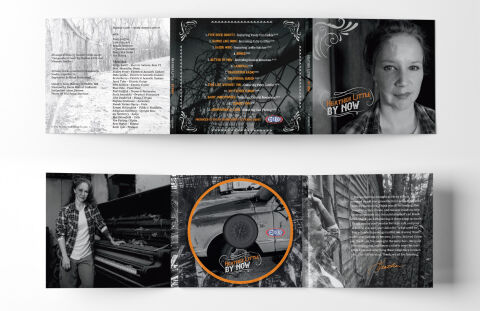
This portfolio design highlights the commercial print layout, packaging architecture, and multi panel graphic narrative for the Heather Little By Now full length studio album. The objective was to design a highly atmospheric, emotionally raw, and cohesive multi panel CD digipak that expands upon the artist's roots, folk, and Americana musical heritage, instantly communicating an intimate singer songwriter journey, textured physical depth and a premium collectible product identity for retail distribution.
Design & Requirements Breakdown
Visual Symbolism – The design utilises an expansive, multi panel narrative layout that pairs gritty, high contrast monochrome photography with striking graphic framing. The exterior panels showcase intimate, candid portraits of the artist alongside desolate, weathered landscapes, establishing a powerful tone of vulnerability and quiet resilience. On the interior, a prominent circular focal point framed by a vibrant orange border encapsulates a rugged, vintage truck wheel serving as a metaphor for travel, time, and the underlying themes of a continuous artistic journey. These evocative themes are beautifully integrated with distressed textures and ornate corner flourishes, reinforcing a deeply authentic and organic visual storytelling experience.
Typographic Architecture – The layout maintains a highly structured yet handcrafted information hierarchy across the extensive track list, credits and liner notes. The main artist and album branding features a stylised, vintage inspired cursive serif font enclosed within an elegant, hand drawn vector ribbon banner, accompanied by a distressed block display typeface for the title "BY NOW". For the dense technical credits and track listings, clean, high contrast sans-serif and serif typography blocks are utilised to optimise readability. This careful typographic alignment ensures effortless navigation for the listener while preserving the distinct, rustic visual identity of the physical media display.
Premium Presentation – The promotional artwork is presented in a high fidelity digital and print preview composition, displaying both the fully unfolded exterior and interior spreads of the multi panel digipak layout. Framed cleanly against a neutral, minimalist studio backdrop, this focused presentation emphasises the sharp print resolution, the seamless transitions across panel folds and the meticulous attention to layout grid alignments, offering a highly tactile and professional preview of a completed commercial music release ready for manufacturing.
Strategic Colour Choice – A sophisticated, high contrast palette of deep blacks, charcoal greys, and stark whites forms the primary visual canvas, creating a cinematic, timeless documentary feel. This moody monochrome base is heavily punctuated by strategic pops of warm, vibrant orange specifically on the central circular frame and the artist's signature script. This deliberate colour configuration injects immediate visual energy, balances the darker underlying themes and ensures the package stands out beautifully on retail shelves and digital storefronts alike.
Target Audience Focus – The comprehensive, concept 4first package layout is meticulously tailored to engage dedicated Americana, folk, and indie music collectors who value physical media craftsmanship, lyric sheets, and rich visual storytelling. It captures the attention of retail music shoppers demanding a transparent, highly professional package design that beautifully honors the album's raw, emotional themes and honors the tangible heritage of roots music.