
Hands Like Mine by Heather Little - Single Cover Design
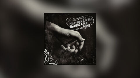
This portfolio artwork highlights the commercial print layout and graphic architecture for Heather Little’s "Hands Like Mine" music single release. The objective was to design a highly atmospheric, emotionally resonant and raw acoustic single cover that captures an intimate folk, Americana singer songwriter aesthetic. The layout instantly communicates an authentic, human centric musical journey, deep personal storytelling and a striking product identity optimised for digital streaming platforms and physical distribution.
Design & Requirements Breakdown
Visual Symbolism - The design features an authentic, high contrast monochrome photograph of two hands gently holding and connecting against a dark, textured background, serving as the core visual narrative. The rough, organic textures and dramatic chiaroscuro lighting emphasise the fine details of the skin, capturing a sense of vulnerability and shared human experience. This evocative focal imagery seamlessly reinforces themes of raw emotional connection, heritage and the intimate, handwritten nature of the artist's music.
Typographic Architecture - The layout incorporates an elegant, vintage inspired typography system positioned in the upper right quadrant to manage the single's identity. The artist's name "HEATHER LITTLE" and the track title "HANDS LIKE MINE" are rendered in a stylised, hand drawn serif typeface nestled within a custom, flowing filigree frame. This deliberate placement, balanced by a matching ornate flourish in the lower left corner, creates a balanced and classic editorial layout that ensures excellent readability on digital streaming thumbnails and physical storefronts.
Premium Presentation - The promotional artwork is presented in a high fidelity digital preview composition, framing the square single cover art precisely against a heavily blurred and desaturated studio vignette backdrop that echoes the out of focus, dramatic tones of the central photograph. This focused layout highlights the sharp visual resolution, the rich grayscale tonal depth and the clean square boundary lines of the artwork. The seamless presentation offers a highly professional and immersive preview of a completed commercial music release ready for market deployment.
Strategic Colour Choice - A sophisticated, monochromatic palette of deep charcoals, ink blacks and vintage off-whites forms the entire photographic canvas, establishing a timeless and somber mood. This historic foundation relies entirely on texture and light contrast rather than vibrant hues, ensuring the typography and raw imagery blend seamlessly into a unified narrative. This distinct de-saturated configuration injects an immediate sense of authenticity and weight, allowing the project to stand out through emotional gravity rather than loud colours on competitive store fronts.
Target Audience Focus - The structured, concept first layout is meticulously tailored to engage modern folk, indie acoustic and roots music enthusiasts looking for honest storytelling, vinyl and CD collectors seeking premium artistic packaging and music consumers demanding a transparent, highly professional package design that beautifully honours a warm, reflective single release.