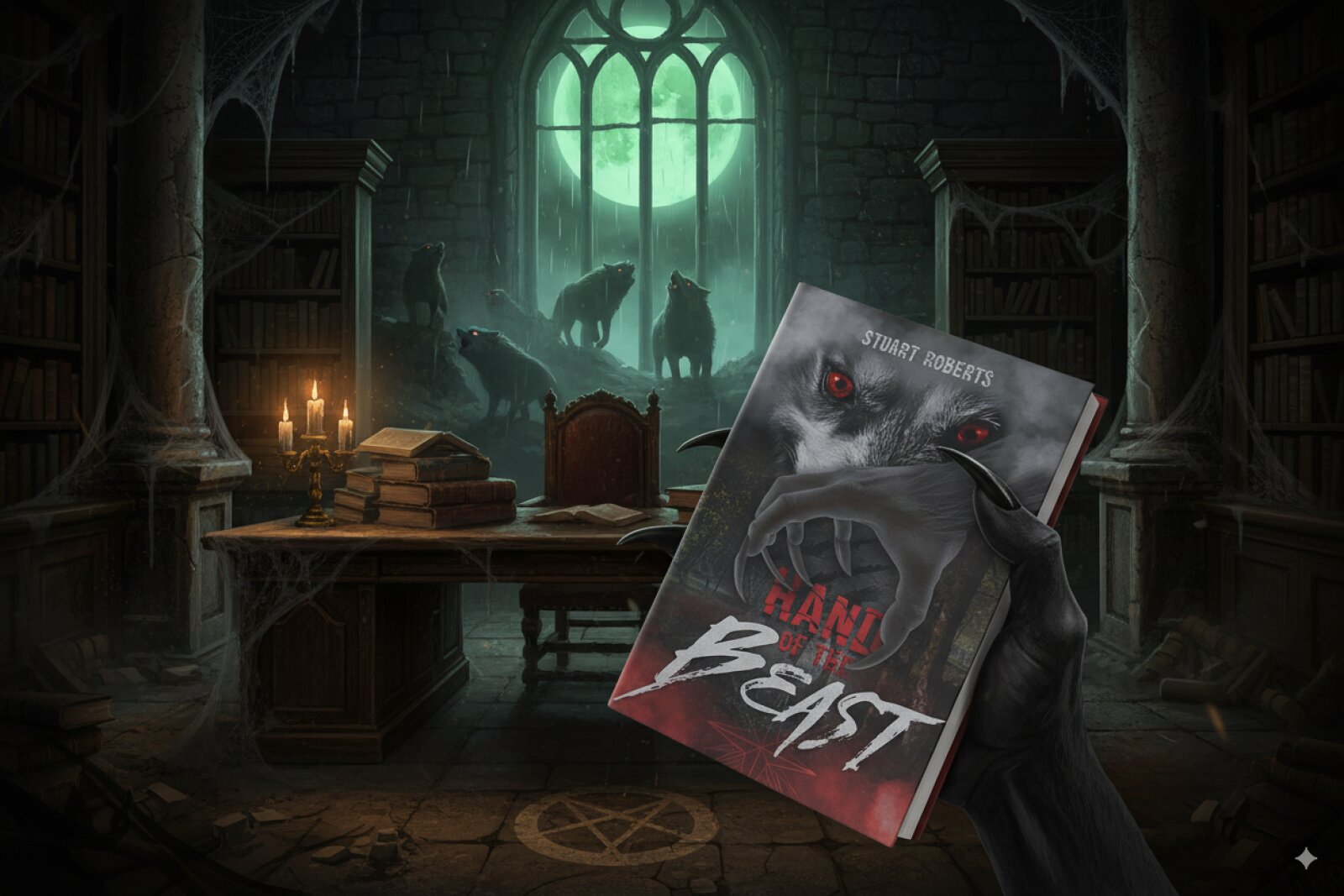
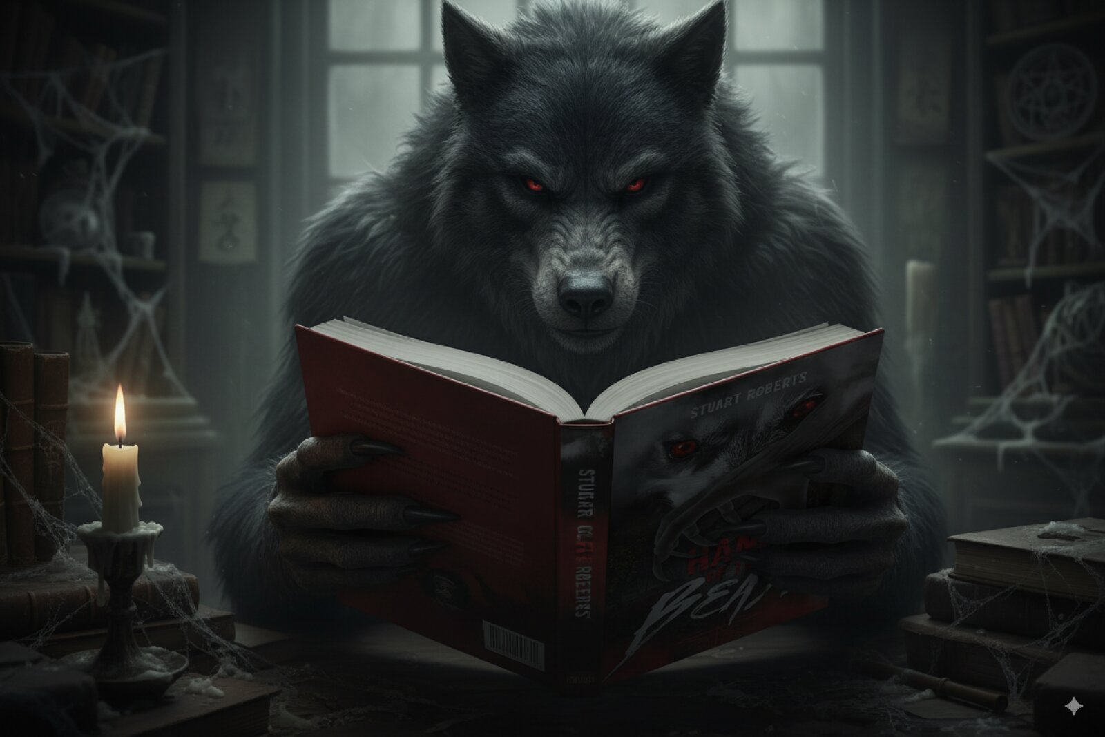
Hand Of The Beast Book Cover
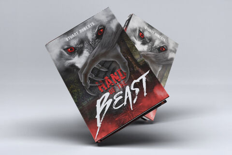
This portfolio showcase highlights the commercial cover illustration and print jacket layout for the Hand of the Beast Book Design Cover. The objective was to design a highly professional, striking and visceral book cover that bridges horror fiction with aggressive editorial graphics, instantly communicating dark thriller tension, monstrous threat and an engaging visual narrative that stands out on a physical or digital bookstore shelf.
Design & Requirements Breakdown
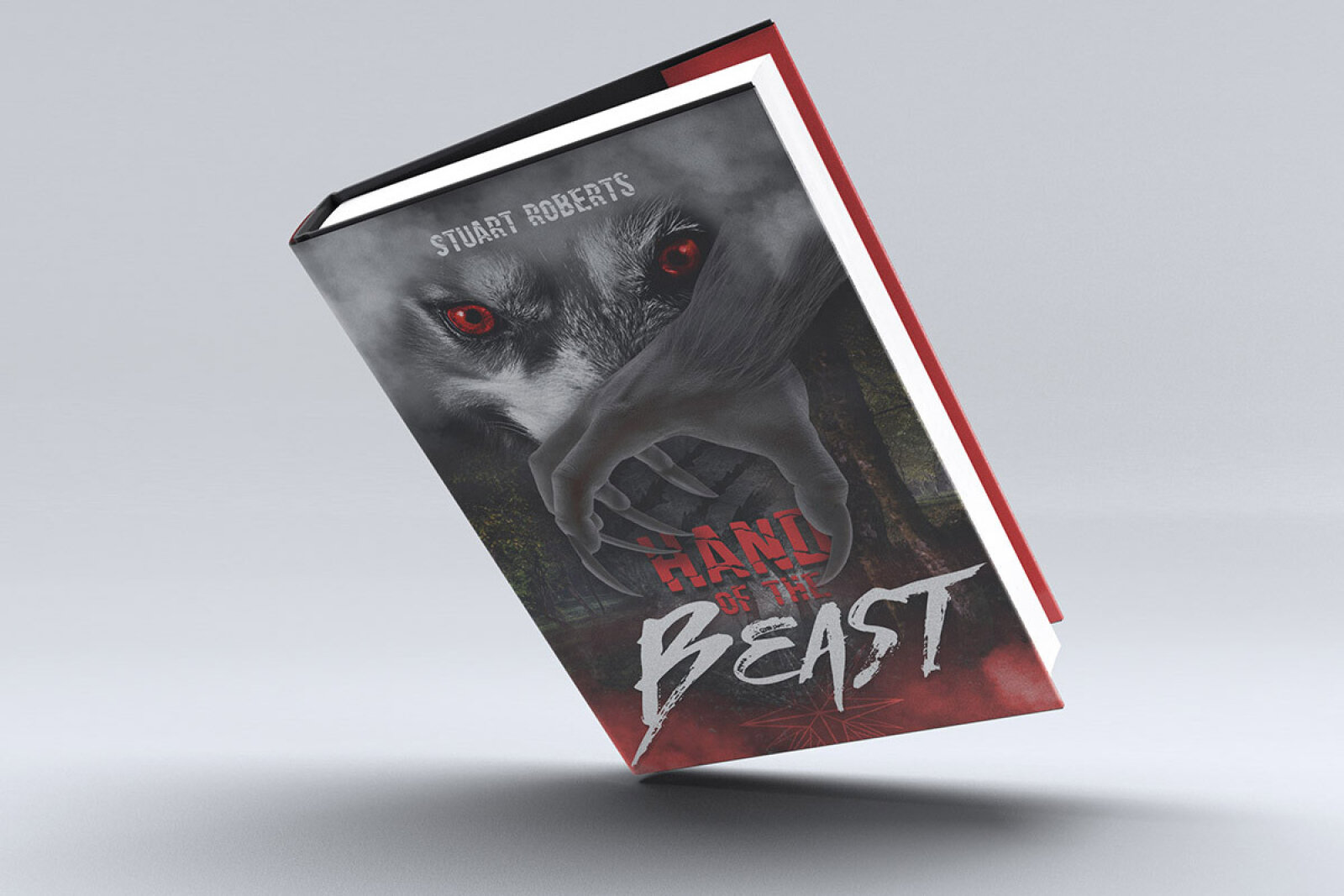
Visual Symbolism – The design features a terrifying, stylised illustration of a creature's face dominated by piercing, hyper detailed red eyes that loom from the upper canvas. This monstrous theme is beautifully layered into the graphic architecture via a massive, clawed beastly hand emerging from a misty, dark forest backdrop, while the lower quadrant shifts into an abstract blood red geometric web texture, visually reinforcing a sense of entrapment, physical danger, and intense narrative conflict.
Typographic Architecture – A clean, modern sans-serif display typeface blocks out the author’s name "STUART ROBERTS" across the top margin, utilising a high contrast white font. The primary title text splits into two contrasting typographic styles: the word "HAND" is rendered in a blocky, distressed red font, while "BEAST" commands the lower half in an aggressive, sharp angled white brush script typeface with dynamic paint splatters to instantly capture reader focus and evoke immediate terror.
Premium Presentation – The promotional asset is presented in a premium 3D book mock up perspective showcasing two copies of the book resting at an overlapping dynamic angle against a neutral, soft grey studio backdrop. This composition emphasises mass print production quality, book spine depth, and crisp edge definitions, offering a highly tactile and immersive preview of a completed commercial editorial touch point.
Strategic Colour Choice – A sophisticated, chilling palette of muted charcoal greys, deep forest blacks and crisp whites forms the core background canvas, heavily punctuated by strategic, high visibility pops of crimson and blood red on the title lettering and beastly eyes. This distinct, high contrast palette evokes immediate psychological horror, visceral tension, and an easily recognisable literary identity that commands attention from passing horror and thriller readers.
Target Audience Focus – The structured, concept first layout is tailored to engage everyday fiction readers looking for gripping dark fantasy plots, horror enthusiasts seeking advanced werewolf or creature feature themes, and digital bookstore shoppers demanding an engaging, high quality, and visually arresting cover design that promises an immersive storytelling experience.