
Frozen By System Sync Music Single Cover Design
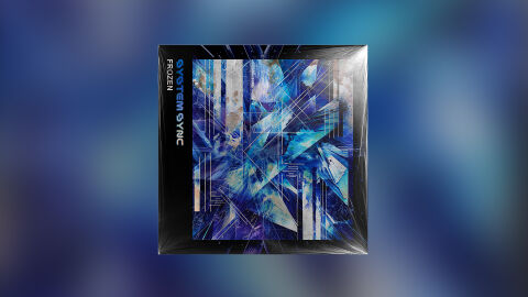
This portfolio showcase highlights the commercial print layout and graphic architecture for the System Sync Frozen Music Single CD Cover Design. The objective was to design a highly atmospheric, cutting edge and cinematic CD single cover that bridges futuristic electronic music aesthetics with premium physical packaging, instantly communicating a colder sonic environment, intricate digital composition, and a striking product identity for retail distribution.
Design & Requirements Breakdown
Visual Symbolism – The design features a complex, abstract visual matrix dominated by jagged, sharp angled crystal structures and overlapping shards of shattered glass that fill the primary central canvas. This electronic and geometric theme is beautifully layered via fractured light streaks, fine line digital matrices, and organic texture overlays mimicking a deep frost, visually reinforcing frozen terrains, systemic complexity, and the precise, mechanical nature of electronic audio synthesis.
Typographic Architecture – A stylised, custom electronic sans-serif display typeface blocks out the artist’s name "SYSTEM SYNC" sideways inside a sleek black border on the left margin, utilising a high contrast ice blue colour palette to anchor the project's brand signature. Directly underneath, the single title "FROZEN" is rendered in a clean, minimalist white font, keeping a highly structured and lightweight information hierarchy optimised for effortless reading across digital platforms or physical store displays.
Premium Presentation – The promotional artwork is presented in a premium 3D retail packaging mock up perspective showcasing a pristine square sleeve encased in a realistic, glossy cellophane protective wrap. The composition accurately handles sharp light reflections, soft corner crinkles, and dynamic highlights against an immersive, out of focus blue studio background, offering a highly tactile, professional preview of a completed commercial music release ready for distribution.
Strategic Colour Choice – A sophisticated, synth focused palette of deep indigo, electric cobalt, and icy cerulean blue forms the core brand signature elements and graphic panels, heavily contrasted by the stark black border frame and clean white typography accents. This distinct, cool toned palette evokes immediate atmospheric depth, electronic logic, and a highly recognisable visual identity that cuts through competing digital music storefronts.
Target Audience Focus – The structured, concept first layout is tailored to engage dedicated electronic music collectors looking for striking physical releases and ambient audio enthusiasts seeking immersive visual storytelling, and retail music shoppers demanding a transparent, highly professional package design that beautifully honors the track's futuristic concept.