
Fresh Drop Product Label Design
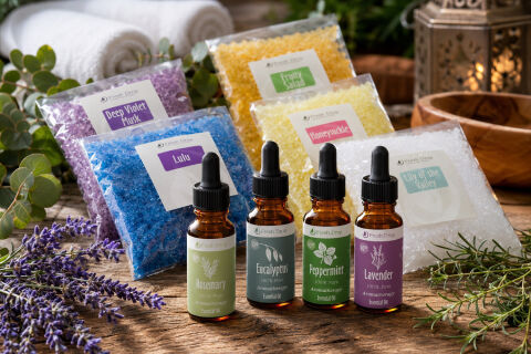
This portfolio piece highlights the serene, therapeutic art direction and structured, wellness focused brand architecture designed for Fresh Drop’s holistic aromatherapy and bath product line. The design objective was to build a cohesive, premium family of labels that communicates natural purity, botanical relaxation and sensory rejuvenation across both liquid essential oil dropper bottles and crystal bath salt packets. The visual strategy relies on a clean, unified label hierarchy that effortlessly scales across different botanical extracts and aromatic blends, ensuring immediate brand recognition within a luxury spa and self-care product category.
Design & Requirements Breakdown
Visual Symbolism – Each label features an organic, elegant botanical illustration such as hand drawn rosemary springs, eucalyptus twigs, mint leaves, and lavender stems that grounds the product name beneath a minimalist, circular brand logo emblem. This clean visual structure immediately evokes natural botanical purity, therapeutic relaxation and premium organic sourcing, beautifully complemented by amber glass dropper bottles, crisp black caps and a rustic, sunlit spa background filled with fresh eucalyptus leaves, lavender blooms and rolled white towels.
Typographic Architecture – An elegant, flowing script typeface gives core botanical names like "Rosemary", "Eucalyptus", "Peppermint", and "Lavender" an artisanal, handcrafted feel, while the bath salt packets utilise clean, structured serif titles including "Deep Violet Musk", "Lulu", "Fruit Salad", "Honeysuckle", and "Lily of the Valley." This is perfectly balanced by minimalist sans serif sub-text detailing product purity parameters ("100% Pure", "Aromatherapy", "Essential Oil") and clear white key line panels to guarantee maximum legibility against both dark amber glass and vibrantly coloured crystalline salt textures.
Premium Presentation – The minimalist square and rectangular label layouts maximise front of pack visual clarity while maintaining a compact footprint on small ounce dropper bottles and transparent product bags. This allows the raw, high contrast colours and premium textures of the internal products such as the rich golden oils and vivid blue, purple, and yellow bath crystals to serve as an active element of the packaging design without cluttering the primary typography.
Strategic Colour Choice – A soothing, earth toned base palette is colour coded using soft, nature inspired shades of sage green, deep forest green and rich lavender purple on the oil bottles, mirrored by crisp white backgrounds and coloured accent strips on the bath salt labels. This strategy clearly differentiates the aromatic profiles and therapeutic functions (such as calming, invigorating, or refreshing) while maintaining a strict, harmonious brand ecosystem that feels unified on retail shelves.
Target Audience Focus – The clean, botanical first packaging layout is tailored to attract health and wellness enthusiasts seeking authentic self-care rituals, aromatherapy practitioners prioritising 100% pure organic ingredients and luxury boutique shoppers looking for premium aesthetic bath products that bring a high end, sensory spa experience into the modern home.