Foot Soothers Product Catalogue Design

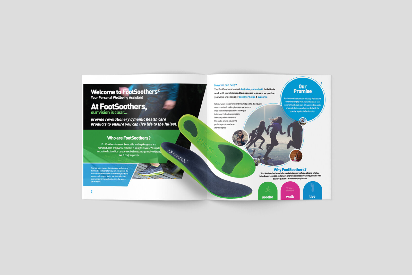
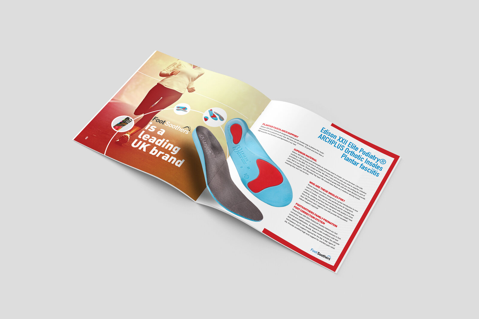
This portfolio design piece highlights the wellness focused art direction and structured corporate layout for the Foot Soothers product catalogue. The design objective was to build a clean, approachable multi-page print document that communicates therapeutic comfort, active lifestyle support and anatomical reliability. The visual strategy relies on a balanced combination of urban lifestyle photography and clean geometric design blocks to ensure a highly professional presentation that translates seamlessly across physical corporate distribution and digital PDF downloads.
Design & Requirements Breakdown
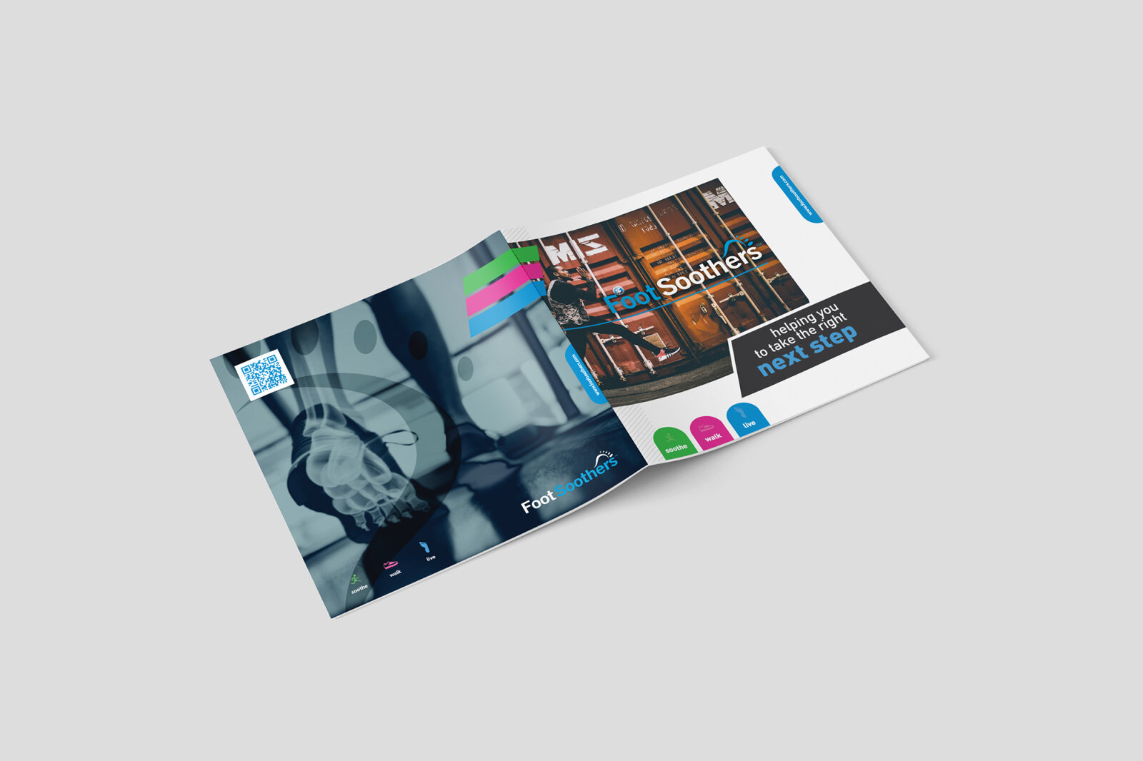
Visual Symbolism – The cover layout features a dynamic, angled visual grid that overlays an energetic, documentary style photograph of an active lifestyle in an urban setting. This sharp, multi-paneled structure uses clean white margins and curved accent tabs to seamlessly divide information, symbolising motion, progress and targeted relief, beautifully framed by a minimalist, deep slate blue studio vignette background.
Typographic Architecture – A modern, clean sans serif typeface organises the master branding "Foot Soothers," pairing a friendly light blue for "Foot" with a crisp white for "Soothers" to maximise instant brand recognition. This layout is anchored by an impactful, benefit driven sub-headline tagline, "helping you to take the right next step," using a high contrast white and bright blue typographic hierarchy that ensures absolute clarity and editorial readability.
Premium Presentation – The brochure artwork is displayed in a high end, angled digital print mock up format that showcases the square booklet geometry. The presentation emphasises a clean, flat lay perspective that draws immediate focus to the crisp trim boundaries and corporate styling, while individual coloured index tabs vibrant green, hot pink, and bright blue run along the bottom and side margins to indicate an intuitive, user friendly product categorisation system inside.
Strategic Colour Choice – The colour palette relies on a balanced foundation of deep charcoal and stark white, injected with high energy pops of electric blue, magenta pink and lime green on the navigation tabs and branding details. This deliberate colour strategy moves away from cold, sterile clinical templates, introducing an active, energetic lifestyle wellness identity that makes podiatric care feel accessible and contemporary.
Target Audience Focus – The structured, consumer first layout is tailored to engage health conscious individuals seeking everyday mobility relief, medical practitioners and podiatrists looking for professional product handouts and retail buyers demanding a polished, premium catalogue that honours physical wellness and clear product accessibility.