

Foot Soothers Discount Code Flyer Design
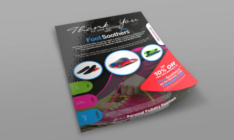
This portfolio showcase highlights the marketing layout and promotional print asset design for the Foot Soothers discount code flyer. The objective was to design a highly professional, vibrant, and engaging customer insert that bridges orthopedic wellness commerce with direct to consumer digital design, instantly communicating podiatrist precision, brand reliability, and an optimised customer retention funnel through strategic repeat purchase incentives.
Design & Requirements Breakdown
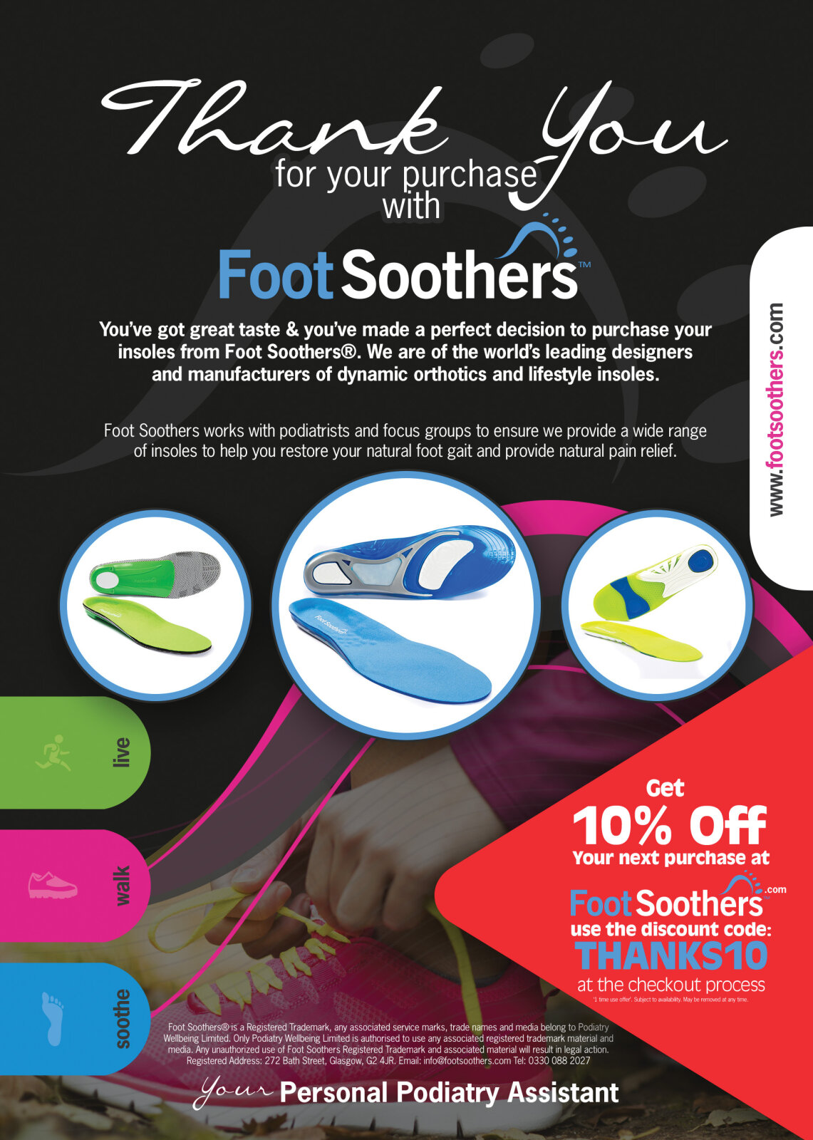
Visual Symbolism – The design features a trio of circular product showcases highlighting various ergonomic insole models across the central canvas, instantly anchoring the brand’s focus on diverse footwear comfort solutions. This orthopedic theme is beautifully echoed via a background lifestyle image of active footwear usage, bordered by fluid, sweeping magenta and neon pink design curves that swoop into the lower right quadrant, visually reinforcing kinetic motion, physical alignment, and modern wellness transparency.
Typographic Architecture – An elegant, flowing script typeface blocks out a personalised "Thank You for your purchase" message across the upper margin, flanked by a bold, clean sans-serif branding text for "Foot Soothers". Below this, a highly legible body paragraph details the brand's commitment to foot health, while a striking, ultra bold white sans-serif font dominates the lower right callout block to announce an immediate "10% Off" discount and a clear "THANKS10" promotional code, keeping a lightweight information hierarchy optimised for effortless reading and rapid digital conversion.
Premium Presentation – The customer insert collateral is presented in a premium 3D print mock up perspective showcasing a single printed flyer sheet resting at an angle on a neutral grey studio backdrop. This dynamic composition accentuates a realistic high gloss UV spot finish reflecting light across the textured dark header canvas, emphasising premium production values, crisp page margins, and a polished physical touch point.
Strategic Colour Choice – A sophisticated, professional palette of deep charcoal grey, stark white, and vibrant magenta forms the core brand signature layout, heavily punctuated by high visibility pops of neon lime green and bright cyan within product accent tabs and the web url handle. This distinct, high contrast palette evokes immediate medical wellness trust, contemporary retail logic, and an energetic, highly recognisable orthotics brand identity.
Target Audience Focus – The structured, retention first layout is tailored to engage everyday online shoppers seeking relief from chronic foot fatigue, athletic individuals looking for advanced sports performance support, and health conscious buyers demanding an effortless, transparent e-commerce experience that reward brand loyalty.