
Flywheelz Packaging Design
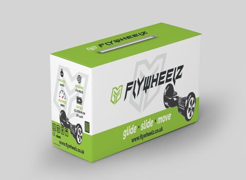
This portfolio showcase highlights the packaging design and retail box structure for the Flywheelz Self Balancing Electric Scooter. The objective was to design an energetic, high impact retail package that bridges futuristic personal transportation with clear technical reliability, instantly communicating electric speed, long range battery life, and smooth maneuverability to tech savvy riders.
Design & Requirements Breakdown
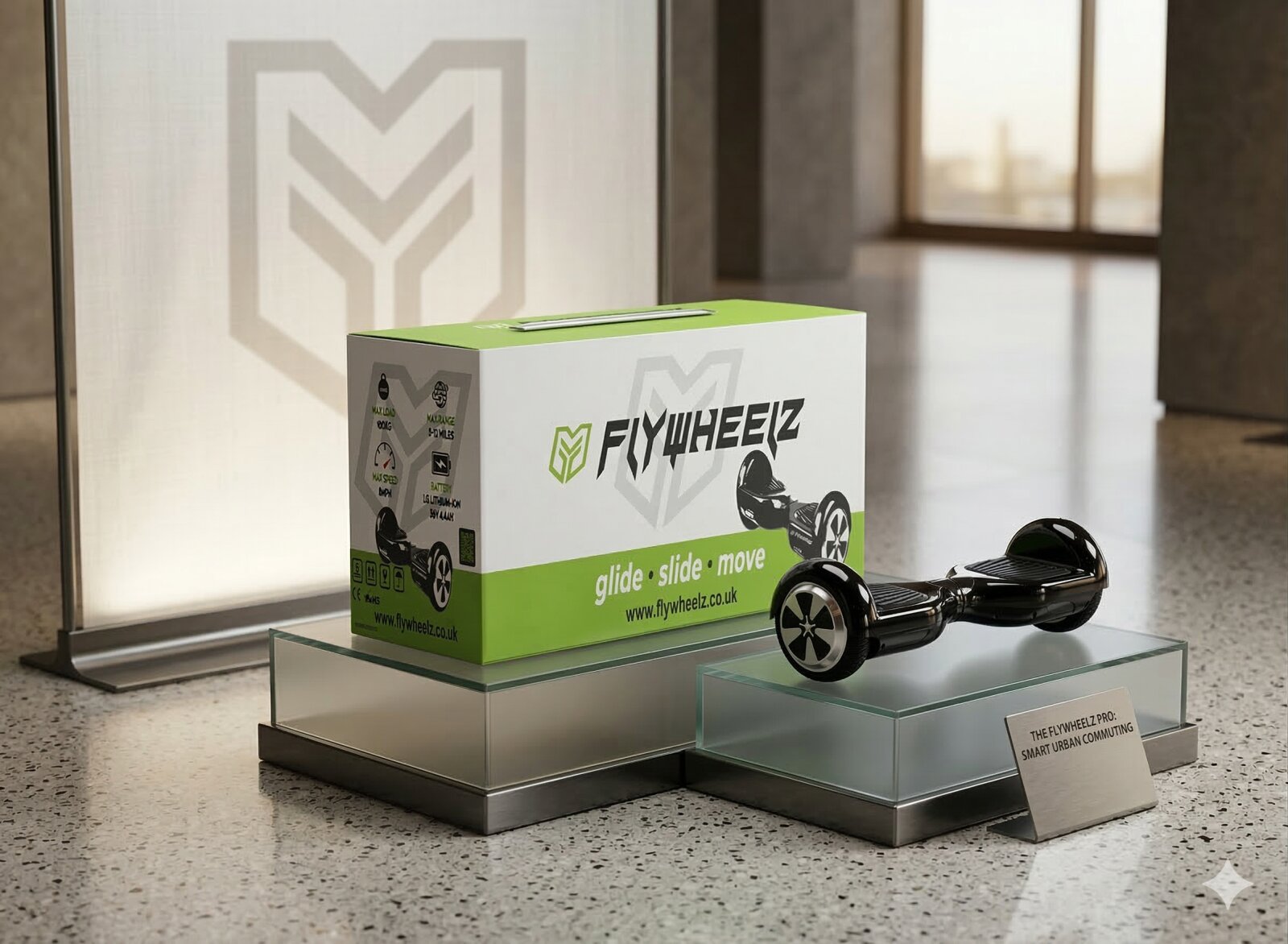
Visual Symbolism – The design features a bold, geometric "F" shield logo set against a clean, dual tone white and electric green background, paired with dynamic product renders of the hoverboard from multiple angles. Distinct technical icon badges (weight capacity, range, speed, and battery voltage) on the side panel visually reinforce engineering precision, rider safety, and modern personal mobility.
Typographic Architecture – A sharp, forward leaning angular display font gives "FLYWHEELZ" a high speed, futuristic tech identity, perfectly balanced by a stylised, handwritten script tagline ("glide • slide • move") along the bottom border to convey effortless balance and dynamic motion.
Premium Presentation – The structural carrying box incorporates an integrated top handle for convenient retail transport. The multi panel layout seamlessly organises key performance metrics, web presence call outs, and CE/RoHS safety compliance certifications across every face for maximum shelf impact and e-commerce display.
Strategic Colour Choice – Vibrant electric lime green is paired with crisp stark white and deep charcoal black accents, establishing a high visibility, eco-friendly palette that signals active kinetic energy, electric performance, and a sleek modern brand identity.
Target Audience Focus – The action oriented, feature rich layout is tailored to engage teens, young adults, and tech enthusiasts looking for cutting edge personal electric vehicles, as well as parents seeking certified, reliable gift hardware.