
Five Dime By Michael Prysock Album Cover Design
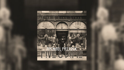
This portfolio showcase highlights the commercial digital layout and graphic architecture for Michael Prysock’s "Five & Dime" music release. The objective was to design a highly atmospheric, historically grounded, and texture rich single cover that bridges vintage early 20th century aesthetics with a clean, modern structural layout, instantly communicating an authentic acoustic folk or roots driven sound, deep organic storytelling, and a striking product identity optimised for digital streaming platforms and social media distribution.
Design & Requirements Breakdown
Visual Symbolism - The design features an authentic, archival sepia toned photograph of a historic storefront, complete with intricate architectural archways, vintage window displays, and classic figures standing in the entryway, serving as the core visual narrative. The weathered facades and early American signage ground the music in raw, historical roots, instantly transporting the viewer to a bygone era. This evocative focal imagery seamlessly reinforces themes of nostalgia, time tested heritage, and authentic, organic storytelling.
Typographic Architecture - The layout incorporates a meticulous, textually rich typography system centred in the lower third quadrant to manage the release's identity. The artist's name "MICHAEL PRYSOCK" is rendered in a clean, stylised white font that balances the complex background details, sitting directly above the main title "FIVE & DIME." The title is blocked out in a bold, custom Art Deco-inspired display typeface featuring distinct geometric lines and a subtle, translucent texture overlay. This deliberate typographic alignment creates an effortless information hierarchy optimised for maximum legibility on small digital streaming thumbnails and scrolling social media feeds.
Premium Presentation - The promotional artwork is presented in a high fidelity digital preview composition, framing the square single cover art precisely against a heavily motion blurred and stretched extension of the store front backdrop. This focused layout highlights the sharp visual resolution, the rich tonal depth of the sepia grading, and the clean square boundary lines of the artwork. By eliminating harsh borders, the presentation offers a highly immersive, tactical, and professional preview of a completed commercial music release ready for digital audio distribution.
Strategic Colour Choice - A sophisticated, monochromatic palette of deep charcoal greys, rich sepia undertones and warm parchment creams forms the entire photographic canvas. This historic foundation is subtly elevated by the clean, bright white tones used for the primary text elements, ensuring the typography remains punchy and readable without disrupting the vintage authenticity of the image. This distinct colour configuration injects an immediate sense of timelessness, balancing rugged historical grit with an approachable, contemporary folk pop visual tone that easily stands out across competitive digital storefronts.
Target Audience Focus - The structured, concept first layout is meticulously tailored to engage modern Americana, folk, and roots music enthusiasts looking for deep historical textures, music collectors seeking polished digital releases and retail music consumers demanding a transparent, highly professional package design that beautifully honors a warm, reflective single release.