
Family Party Time Cd Cover Design
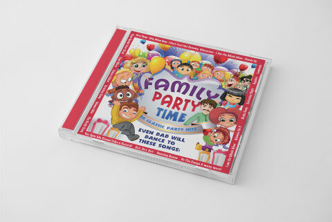
This portfolio artwork highlights the commercial print layout and graphic architecture for the Family Party Time: 20 Classic Party Hits Music Compilation CD Cover Design. The objective was to design a highly atmospheric, vibrant and energetic album cover that bridges playful entertainment with premium physical packaging, instantly communicating a sense of shared family fun, festive celebration and a striking product identity for retail distribution.
Design & Requirements Breakdown
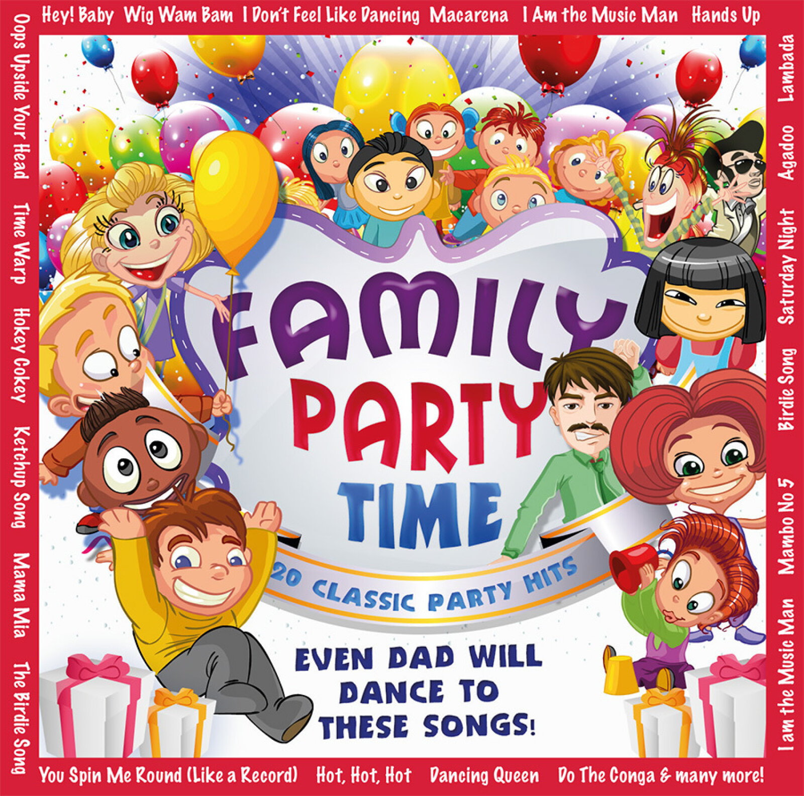
Visual Symbolism – The design features a lively cartoon illustration of a diverse family group surrounded by floating balloons, colorful confetti and gift boxes at the centre of the layout, serving as the core visual narrative. A fun, relatable character representing a dancing father anchors the lower half of the graphic architecture, directly emphasising the album's humorous and engaging call to action slogan. This visual configuration seamlessly reinforces themes of multi generational inclusion, high energy party vibes and the joyful spirit of family gatherings.
Typographic Architecture – A stylised, bubble inspired dimensional font blocks out the main title "FAMILY PARTY TIME" inside a central white shield badge, utilising alternating purple, red and blue tones to capture a playful aesthetic. Directly beneath, the descriptive subtitle "20 CLASSIC PARTY HITS" is rendered in a clean, high contrast sans-serif font across a curved blue ribbon banner. This deliberate typographic alignment is framed by a dense, repeating track list border that outlines the entire square frame, keeping an informative hierarchy optimised for effortless reading across retail media displays.
Premium Presentation – The promotional artwork is presented in a high fidelity digital and print preview composition, displaying the square jewel case booklet angled precisely against a clean, neutral white studio backdrop. This focused mock up layout emphasises the sharp print resolution, the clarity of the clear plastic casing, and the vibrant red spine strip accent, offering a highly tactile and professional preview of a completed commercial music release ready for retail distribution or physical package manufacturing.
Strategic Colour Choice – A sophisticated, multi layered palette of electric blue, candy red, and sunburst yellow forms the core brand signature canvas, heavily energised by bright primary and secondary accent tones. This distinct, high contrast colour palette evokes immediate holiday or birthday cheer, cartoon authenticity and an energetic visual identity that effortlessly cuts through competing children's entertainment and compilation album displays.
Target Audience Focus – The structured, concept first layout is meticulously tailored to engage parents organising children's birthdays, families seeking nostalgic background soundtracks for seasonal gatherings and retail music shoppers demanding a transparent, highly professional package design that beautifully honours a fun loving, energetic theme.