Eye Care Excellence Stationery Design
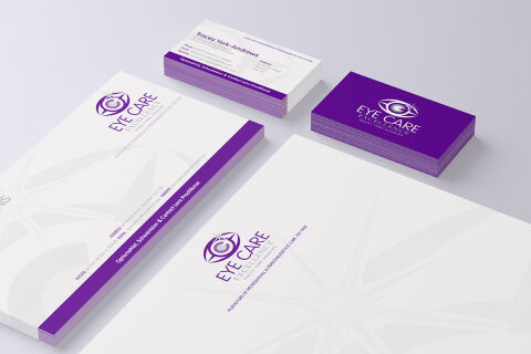
This portfolio showcase highlights the corporate identity layout and print asset coordination for the Eye Care Excellence business stationery. The objective was to design a highly clinical, clean, and professional corporate stationary that bridges medical optics credibility with high end retail styling, instantly communicating clinical precision, trusted optical expertise, and specialised patient care.

Design & Requirements Breakdown
Visual Symbolism – The design features a stylised, abstract eye icon containing a sharp circular iris and lens geometry at its core, serving as the central brand emblem. An expansive, multi pointed starburst or compass watermark motif subtly spans across the lower half of the white letterhead canvas, visually reinforcing absolute focal accuracy, diagnostic clarity, and visionary healthcare leadership.
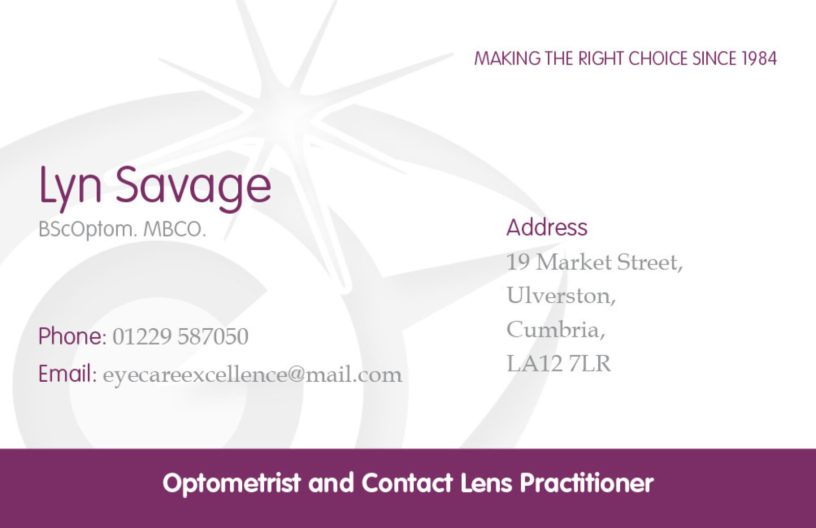
Typographic Architecture – A clean, intellectual sans-serif display typeface blocks out "EYE CARE EXCELLENCE" directly beneath the main logo badge, accompanied by a smaller, refined sub tagline reading "PURVEYORS OF PROFESSIONAL & PERSONALISED EYE CARE". On the executive business cards, this typography maintains a highly precise, minimal alignment, balancing clinical specialist credentials such as the name "Tracey York-Andrews"—with clear professional descriptions ("Optometrist, Refractionist & Contact Lens Practitioner"), keeping a lightweight information hierarchy optimised for quick reading.
Premium Presentation – The stationery collection is showcased in a premium 3D stacked print mockup composition resting on a soft, neutral studio backdrop. This isometric perspective highlights a stack of official letterhead sheets alongside a companion notepad block and two distinct stacks of business cards displaying both the structured text based contact front and the solid, full bleed violet brand backing demonstrating a polished corporate suite optimised for optical clinics, prescription issuance, and professional correspondence.
Strategic Colour Choice – A deep, authoritative violet purple serves as the primary brand signature and solid block accent, which is heavily contrasted by a crisp white paper canvas and a delicate, muted grey watermark motif. This distinct, high contrast palette evokes immediate medical trust, professional integrity, and an upscale, clinical boutique identity that breaks away from conventional medical blues.
Target Audience Focus – The structured, clinical first layout is tailored to engage optical patients seeking precise eye examinations, retail consumers investing in premium prescription eyewear, and healthcare industry partners demanding a highly credible, professional, and well established corporate brand presence.