
Etta James O Happy Day Cd Cover Design
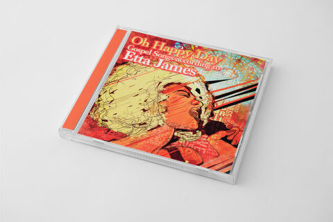
This portfolio piece highlights the commercial print layout and graphic architecture for the Oh Happy Day: Gospel Songs according to Etta James CD Cover Design. The objective was to design a highly atmospheric, emotionally raw and visually kinetic album cover that bridges roots gospel tradition with a striking retro pop art aesthetic, instantly communicating powerful vocal performance, spiritual depth and a premium product identity for retail distribution.
Design & Requirements Breakdown
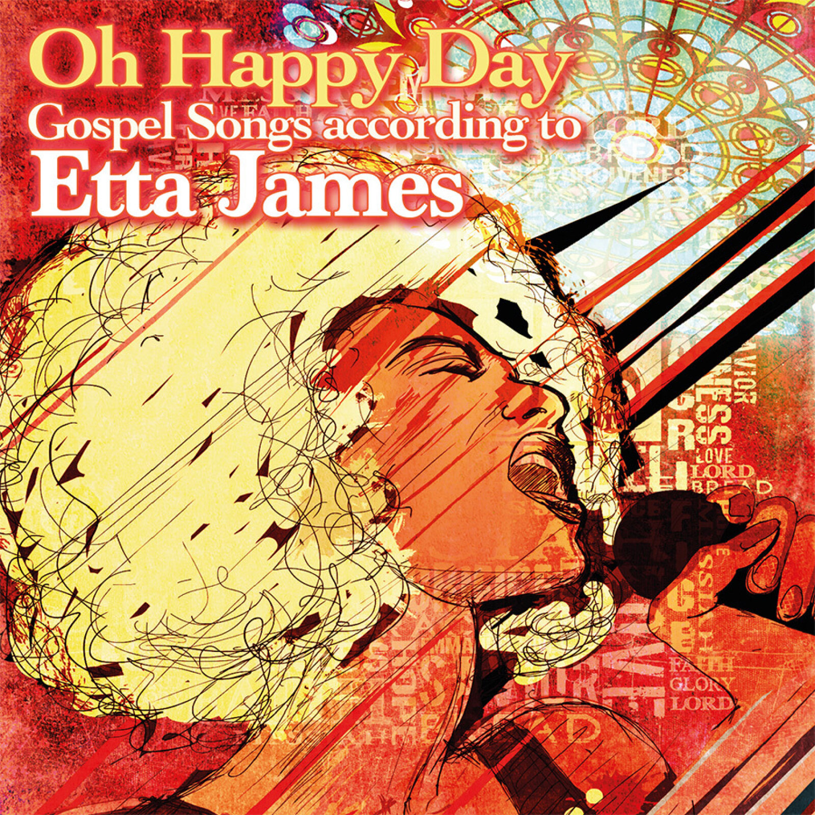
Visual Symbolism – The design features a stylised, highly expressive vector illustration of Etta James lost in mid performance at the lower quadrant of the layout, serving as the core visual narrative. Her iconic blonde afro and dynamic facial expression are layered over a complex, textured background of distressed typography collage, vintage floral flourishes and energetic graphic motion lines slicing through the composition. This raw and intense configuration seamlessly reinforces themes of deep soul storytelling, vocal power and the profound emotional release inherent to gospel music heritage.
Typographic Architecture – The layout utilises an elegant, retro inspired serif typeface to block out the album identity across the upper left quadrant. The main title "Oh Happy Day" is rendered in a warm cream tone, followed by the descriptive subtitle "Gospel Songs according to" in a smaller, tight layout grid. The artist's name "Etta James" commands the final tier of the header in a larger, high contrast point size. This deliberate typographic alignment establishes an effortless information hierarchy that remains perfectly legible across digital streaming thumbnails and brick and mortar retail shelves alike.
Premium Presentation – The promotional artwork is presented in a high fidelity digital and print preview composition, displaying the square jewel case booklet angled precisely against a clean, neutral grey studio backdrop. This focused mock up layout emphasises the sharp print resolution, the complex textures of the mixed media artwork and the contrasting orange spine strip accent, offering a highly tactile and professional preview of a completed commercial music release ready for manufacturing or physical distribution.
Strategic Colour Choice – A sophisticated, warm palette of coral oranges, terracotta reds, and antiqued cream tones forms the primary visual canvas, creating an immediate sense of vintage nostalgia and organic soul. This earthy, energetic base is beautifully balanced by cool teal undertones and deep charcoal shadows embedded in the graphic architecture. This distinct colour configuration injects a vibrant, mid century aesthetic that cuts through competing digital store fronts and traditional compilation displays.
Target Audience Focus – The structured, concept first layout is meticulously tailored to engage soul, blues and gospel music purists seeking authentic physical releases, retro art collectors drawn to expressive music iconography and retail music shoppers demanding a transparent, highly professional package design that beautifully honors the legendary artist's timeless vocal legacy.