
Essr Logo Design
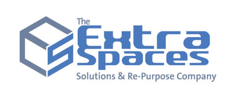
This portfolio showcase highlights the brand identity development for The Extra Spaces Solutions & Re-Purpose Company. The objective was to design a highly structured, professional, and architectural emblem that instantly communicates space optimisation, structural storage, and innovative property repurposing.
Design & Requirements Breakdown
Visual Symbolism - The icon features a geometric, three dimensional cube outline that subtly incorporates the stylised letters "E" and "S" within its structural facets, symbolising smart storage solutions and architectural space.
Typographic Architecture - A bold, wide, and futuristically styled sans-serif typeface is utilised for "Extra Spaces" to convey solid structural reliability, while a clean, condensed font below anchors the corporate tagline.
Premium Presentation - The balanced, horizontal vector layout uses clean geometric lines and precise spacing, ensuring the mark maintains sharp definition on corporate vehicles, warehouse signage, and digital platforms.
Strategic Colour Choice - A professional corporate blue to grey gradient palette is set against a clean white canvas to evoke absolute trust, spatial openness, clinical efficiency, and modern engineering.
Target Audience Focus - The highly technical and clean aesthetic is tailored to appeal to commercial warehouse managers, domestic homeowners seeking premium storage, and businesses looking for expert property repurposing.