
Equip 247 Uk Ebay Discount Thank You Code Flyer Design
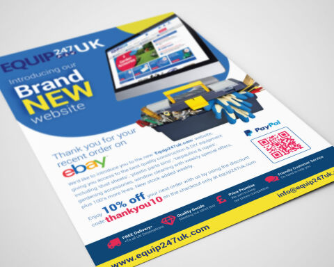
This portfolio showcase highlights the marketing layout and promotional print asset design for the Equip 247 UK eBay Discount thank you flyer. The objective was to design a highly professional, vibrant, and industrially authoritative customer insert that bridges third party marketplace transactions with direct to consumer e-commerce design, instantly communicating hardware reliability, brand utility and an optimised customer retention funnel built to convert platform buyers into independent website users.
Design & Requirements Breakdown
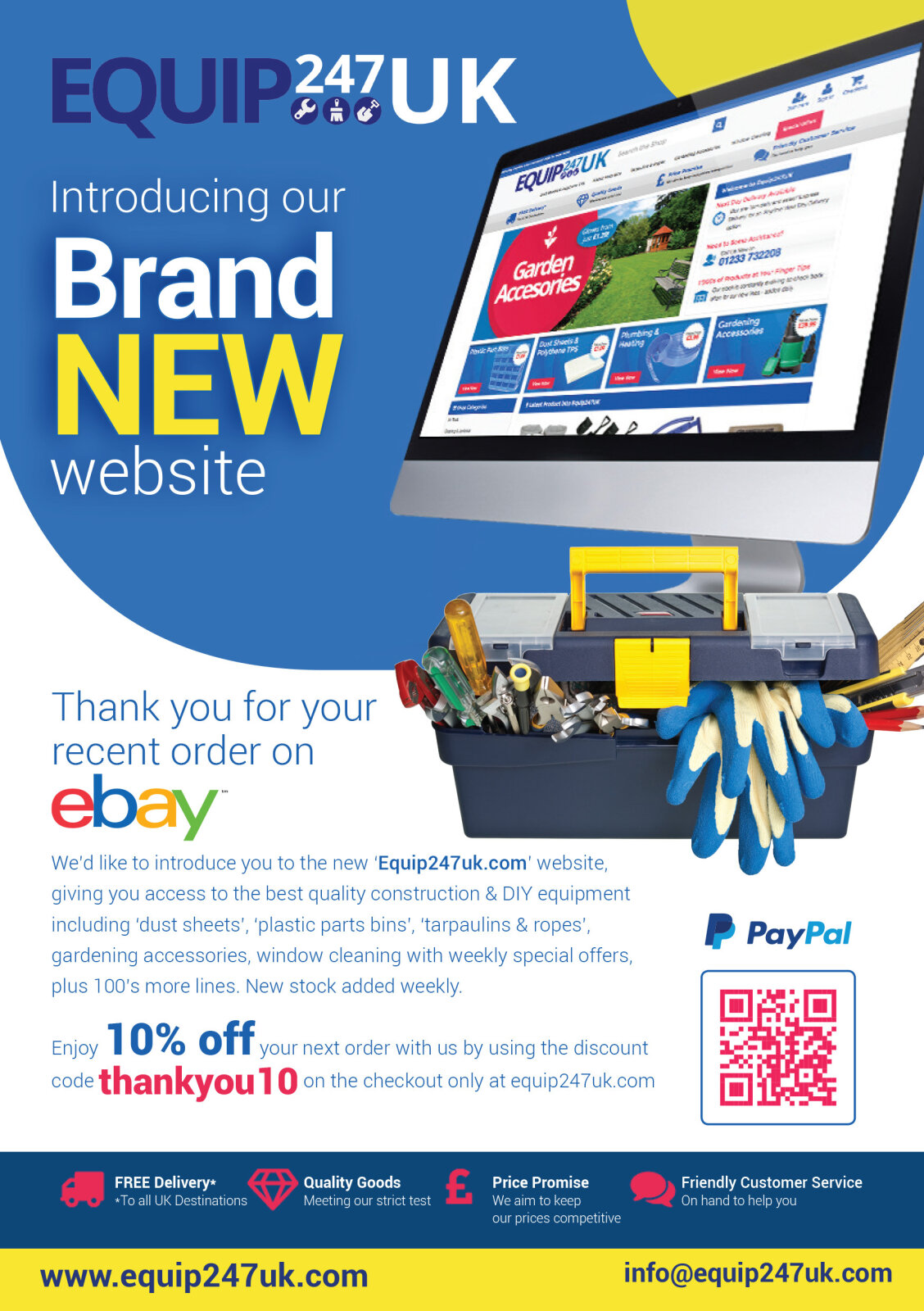
Visual Symbolism – The design features a high fidelity 3D desktop mock up displaying the newly launched homepage interface, paired with a realistic, fully stocked toolbox overflowing with trade tools and safety gloves. This industrial theme is beautifully anchored via the "EQUIP 247 UK" corporate emblem crowning the header, visually reinforcing heavy duty construction supply, hardware availability, and modern digital transparency.
Typographic Architecture – A bold, punchy sans-serif typeface blocks out the primary announcement "Introducing our Brand NEW website" across the upper left margin, utilising an alternating white and high visibility yellow colour hierarchy. Below this, a highly legible body font maintains a precise left alignment to introduce the brand's expansive product lines, while a striking, high contrast red font highlights the "10% off" repeat purchase incentive and the clear "thankyou10" checkout discount code to keep a lightweight information hierarchy optimised for effortless reading and rapid customer conversion.
Premium Presentation – The customer insert collateral is presented in a premium 3D print mock up perspective showcasing a single printed flyer sheet resting at a dynamic angle on a clean white studio backdrop. This composition accentuates realistic page surface curves, precise margin alignments, and crisp edge definitions, offering a highly tactile preview of an unboxing marketing touch point.
Strategic Colour Choice – A sophisticated, trade first palette of deep industrial blue, vibrant primary yellow, and bold red forms the core brand signature blocks and typographic highlights, heavily contrasted by a crisp white information canvas in the central body. This distinct, high impact palette evokes immediate consumer trust, hardware tool logic and a highly recognisable local trade brand identity that stands out upon parcel delivery.
Target Audience Focus – The structured, retention first layout is tailored to engage DIY home improvement enthusiasts looking for accessible equipment, professional trade contractors seeking premium construction supplies, and digital savvy marketplace shoppers demanding a seamless transition to an independent e-commerce checkout experience.