
ekogrips+ Silcone Heat Resistant Gloves Packaging Design
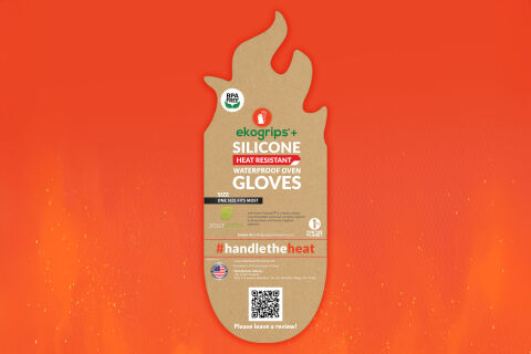
This portfolio piece highlights the bold, high performance art direction and functional structural layout designed for the ekogrips+ Silicone Heat Resistant Gloves packaging. The design objective was to build an eye catching, highly relatable product tag that communicates heavy duty protection, culinary reliability, and environmental consciousness. The visual strategy relies on a specialised, die cut shape and high contrast typographic stacking to instantly capture consumer attention on competitive retail hooks and digital storefronts, proving that utility packaging can be both playful and highly professional.
Design & Requirements Breakdown
Visual Symbolism – The packaging tag features a dynamic, flame shaped die cut silhouette that structurally mirrors the core function of the heat resistant product. This organic, fire inspired shape immediately communicates high temperature defense and kitchen safety, while the natural, unbleached kraft texture of the cardboard stock grounds the product in sustainability, beautifully complemented by a fiery, ambient orange to red background vignette.
Typographic Architecture – A clean, bold sans serif display typeface gives the product title "SILICONE HEAT RESISTANT WATERPROOF OVEN GLOVES" instant readability, anchored smoothly beneath the vibrant green "ekogrips+" master branding. Critical features are emphasised using stark white lettering over a solid red banner block, while sizing requirements ("ONE SIZE FITS MOST") are locked into a high visibility black strip, ensuring essential purchasing data remains perfectly scannable even at a glance.
Premium Presentation – The design leverages a minimal, eco-friendly hang tag format that maximises visual impact while drastically reducing packaging material waste. This clever structural presentation exposes the actual tactile silicone material of the gloves in a retail environment, allowing consumers to feel the grip quality directly while keeping trust badges such as the "BPA Free", "1% For The Planet" and "USA Brand" emblems prominently displayed alongside an integrated QR code for fast digital review onboarding.
Strategic Colour Choice – The colour palette relies on an energetic, high contrast mix of natural earthy kraft browns, blazing reds and crisp whites, beautifully accented by a touch of eco-friendly green in the brand name. This deliberate combination steps away from traditional, sterile kitchen tool boxes to inject a modern, outdoor BBQ and culinary adventure energy into the product, while ensuring the white text cuts sharply through the darker background textures.
Target Audience Focus – The benefit first, structural layout is meticulously crafted to engage barbecue enthusiasts, passionate home chefs, and outdoor grill masters looking for durable, high grade safety gear. It targets practical, eco-conscious consumers demanding a clear, trustworthy product design that honours heavy duty kitchen utility while streamlining the retail and post purchase digital experience.