
Did Lock And Key Business Card Design
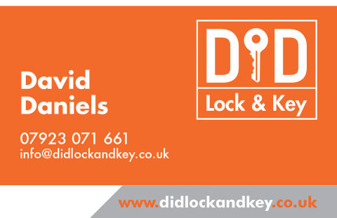
This portfolio showcase highlights the corporate identity design and print asset layout for the D&D Lock & Key Business Card. The objective was to design a highly visible, clean, and modern professional business card that bridges emergency roadside authority with structured graphic design, instantly communicating mechanical reliability, corporate trustworthiness, and rapid client accessibility.
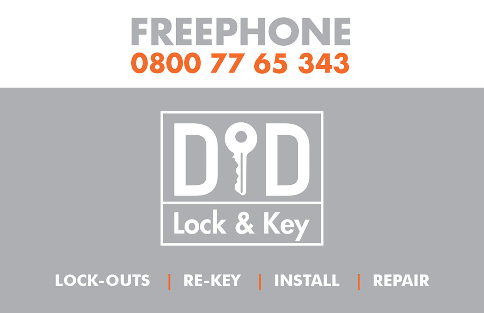
Design & Requirements Breakdown
Visual Symbolism – The design features a stylised, abstract geometric frame enclosing a bold "D&D" monogram that crowns the upper right quadrant as the primary brand mark. This corporate structure beautifully incorporates a clean, white vertical key silhouette into the negative space of the ampersand position, visually reinforcing security solutions, physical access control, and immediate emergency locksmith services.
Typographic Architecture – A clean, modern sans-serif display typeface blocks out "David Daniels" directly on the left canvas, paired with a matching weighted sans-serif reading "Lock & Key" nestled neatly inside the bottom panel of the emblem frame. Below the primary name, an ultra legible, high contrast white sans-serif typeface maintains a highly precise alignment for vital contact details, keeping a lightweight information hierarchy optimised for effortless reading during urgent situations.
Premium Presentation – The professional stationery is presented in a flat, crisp vector layout utilising a dual tone edge definition. This sharp graphic composition showcases a single, official printed card front embedded with a distinct gray accent triangle cutting across the bottom margin, which serves as a dedicated foundation to anchor the company's digital web coordinates in a high contrast orange font.
Strategic Colour Choice – A sophisticated, high visibility palette of safety orange forms the core brand signature canvas, heavily contrasted by a crisp white typography layout and the cool, neutral gray accent footer. This distinct, high impact palette evokes immediate emergency responsiveness, industrial awareness, and a clean, recognisable local trade brand identity that stands out in a crowded wallet.
Target Audience Focus – The structured, service first layout is tailored to engage stranded automotive motorists requiring rapid lock updates, residential homeowners looking for elite domestic security upgrades, and commercial property managers demanding transparent, highly professional emergency trade partnerships.